Earth
What it protects.
Where every product comes from, and where it goes back to.
A name, an identity and packaging for an eco-friendly products company - built to make doing right by the earth look confident.
The brief
Adikart Solutions was launching a range of eco-friendly paper products - tissues, cups, carry bags and packaging - and needed a brand to carry them.
The category is crowded with leaves, greens and guilt. The business wanted something that felt modern and trustworthy to buyers first, with its environmental promise built in rather than painted on.
Doing right by the earth should look confident, not apologetic.
So we started with the name, then built a mark, a warm earth-and-sun palette and a pattern that could stretch from a business card to a tissue pack.
01 · Brand Naming
Earth
Where every product comes from, and where it goes back to.
Ethics
How the business chooses materials, makes products and sells them.
Earthics
Easy to say, unusual enough to trademark, and wide enough for any product line.
Domains we shortlisted
02 · Brand Identity
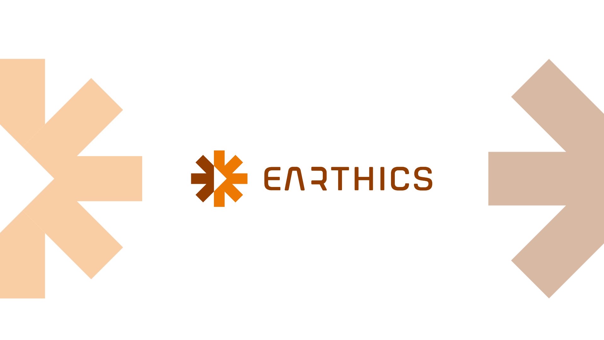
The mark is an asterisk of arrows - half earth-brown, half sun-orange - pointing out to every market and back to one source. Every angle sits on a 45° grid with a single stroke width.
Pattern
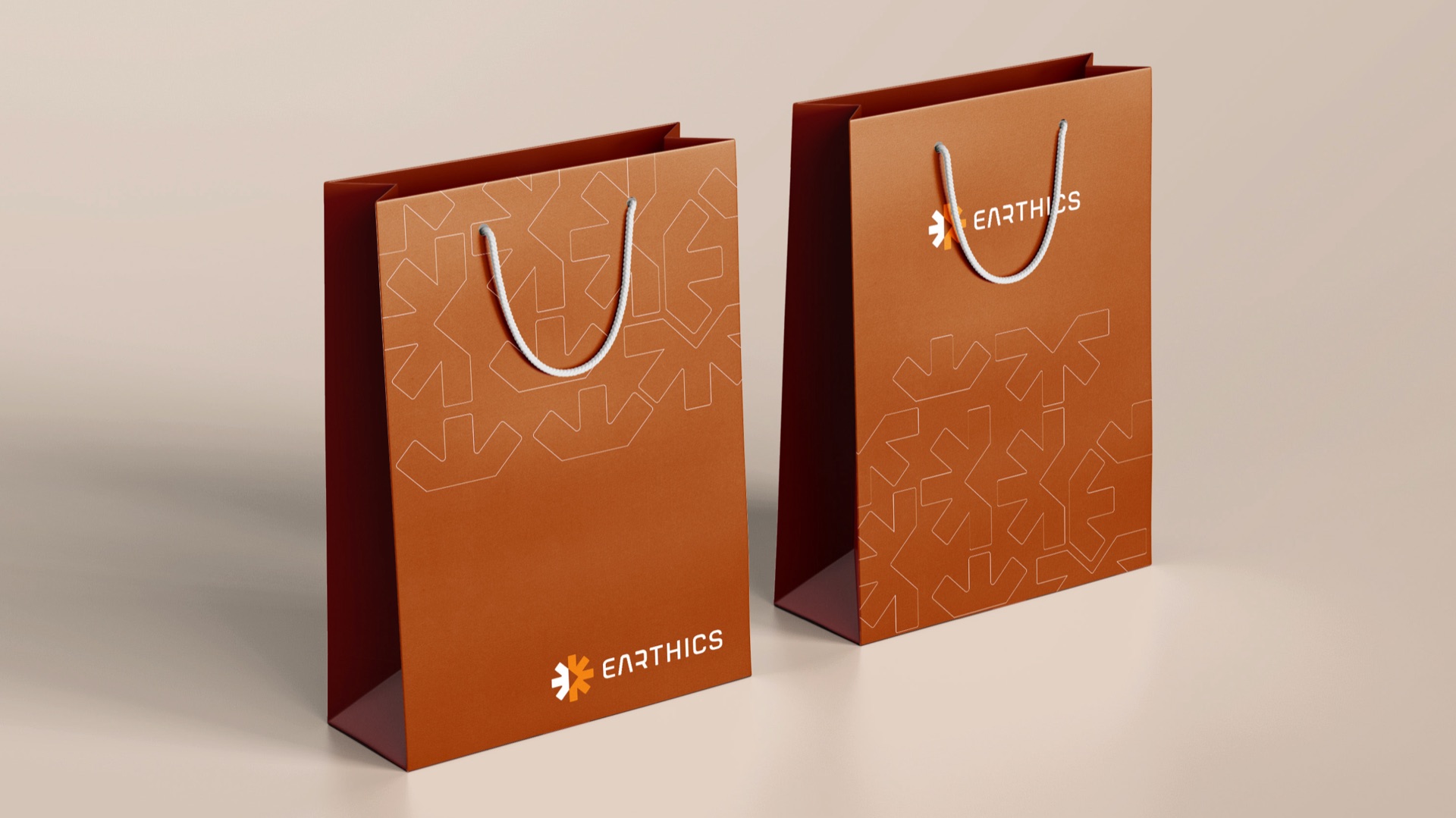
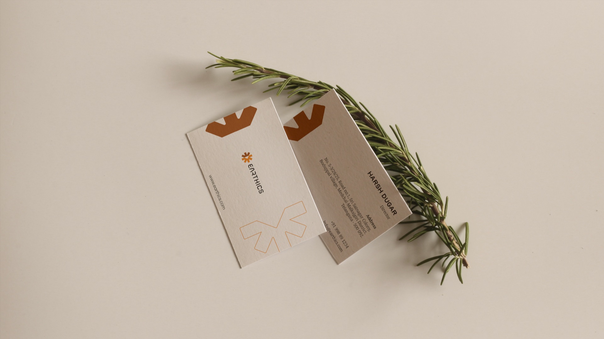
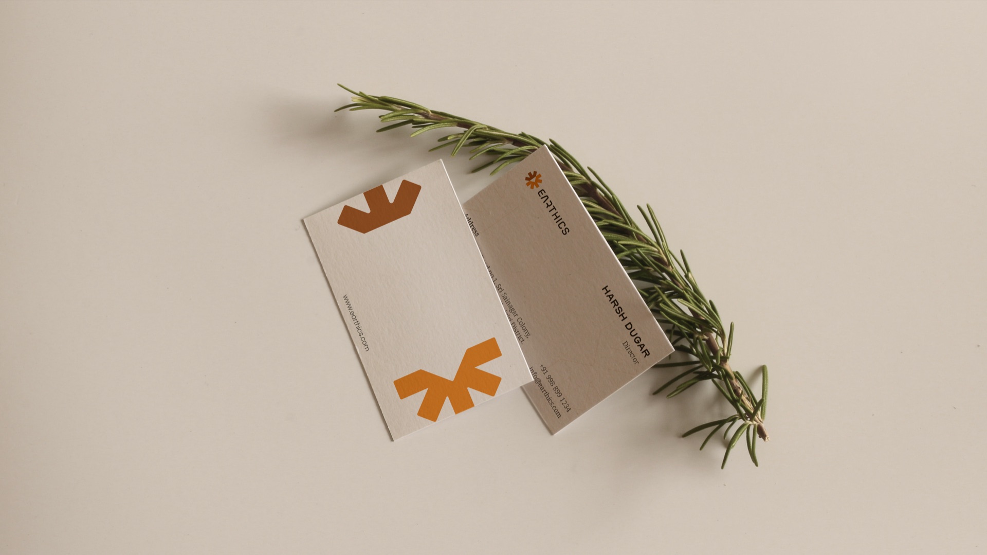
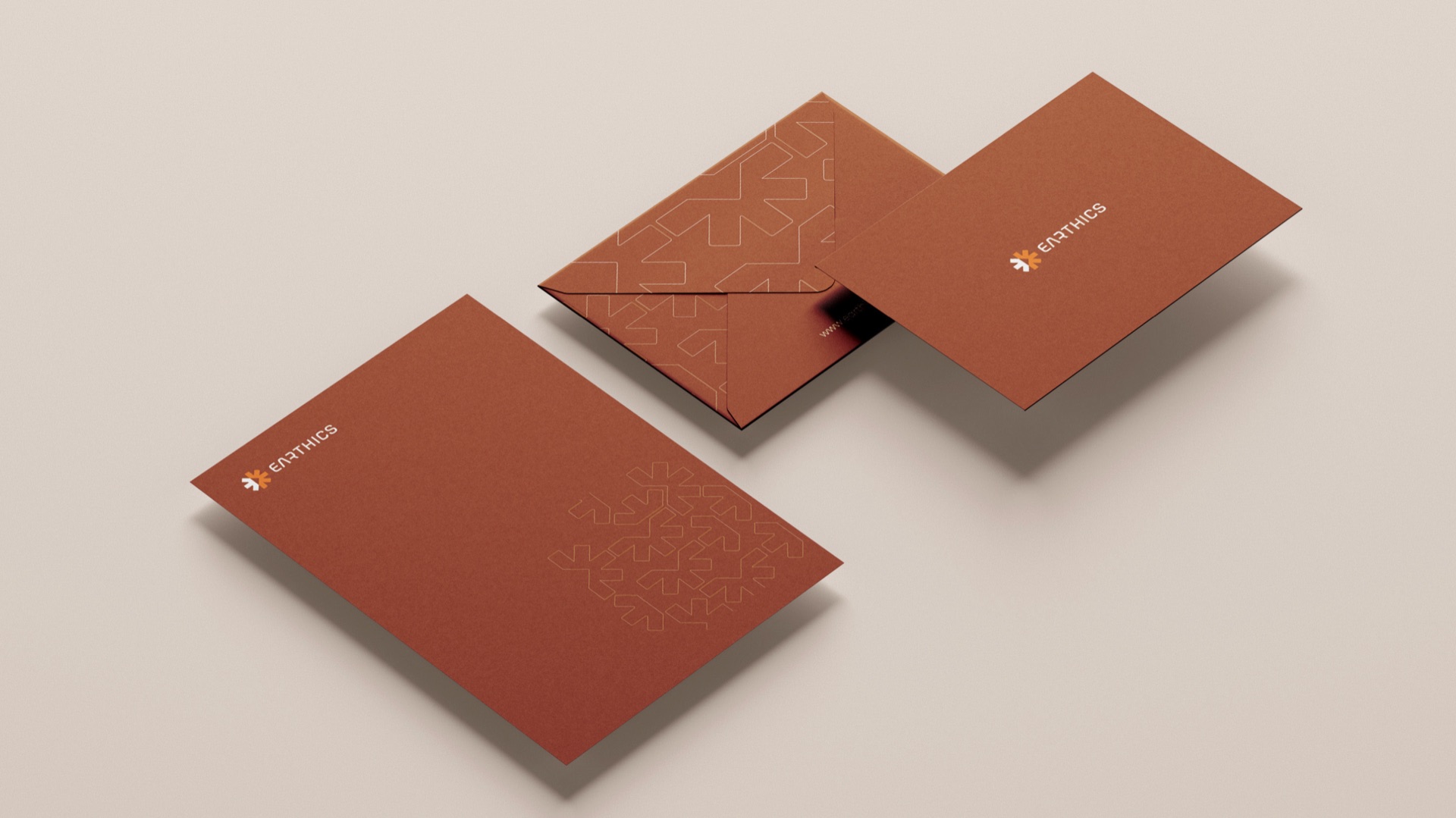
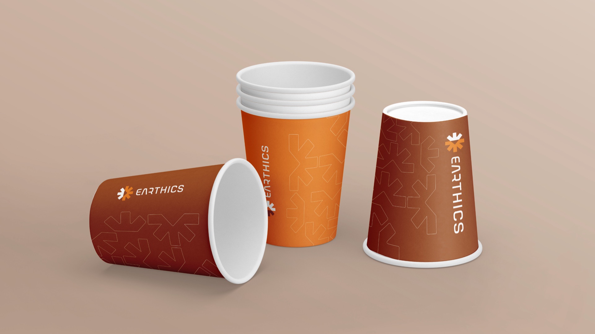
Outlined arrows tile and turn across envelopes, bags and cups - recognisable even when the logo is out of frame.
03 · Collateral
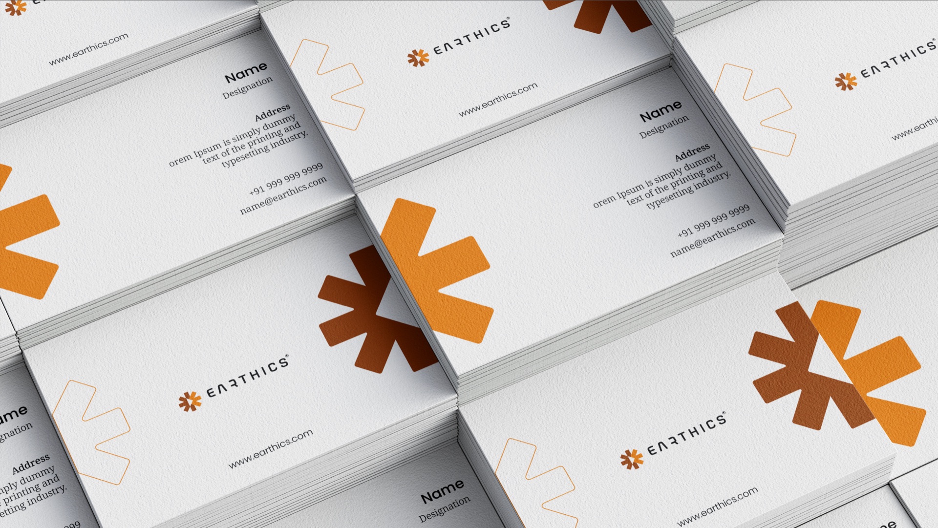
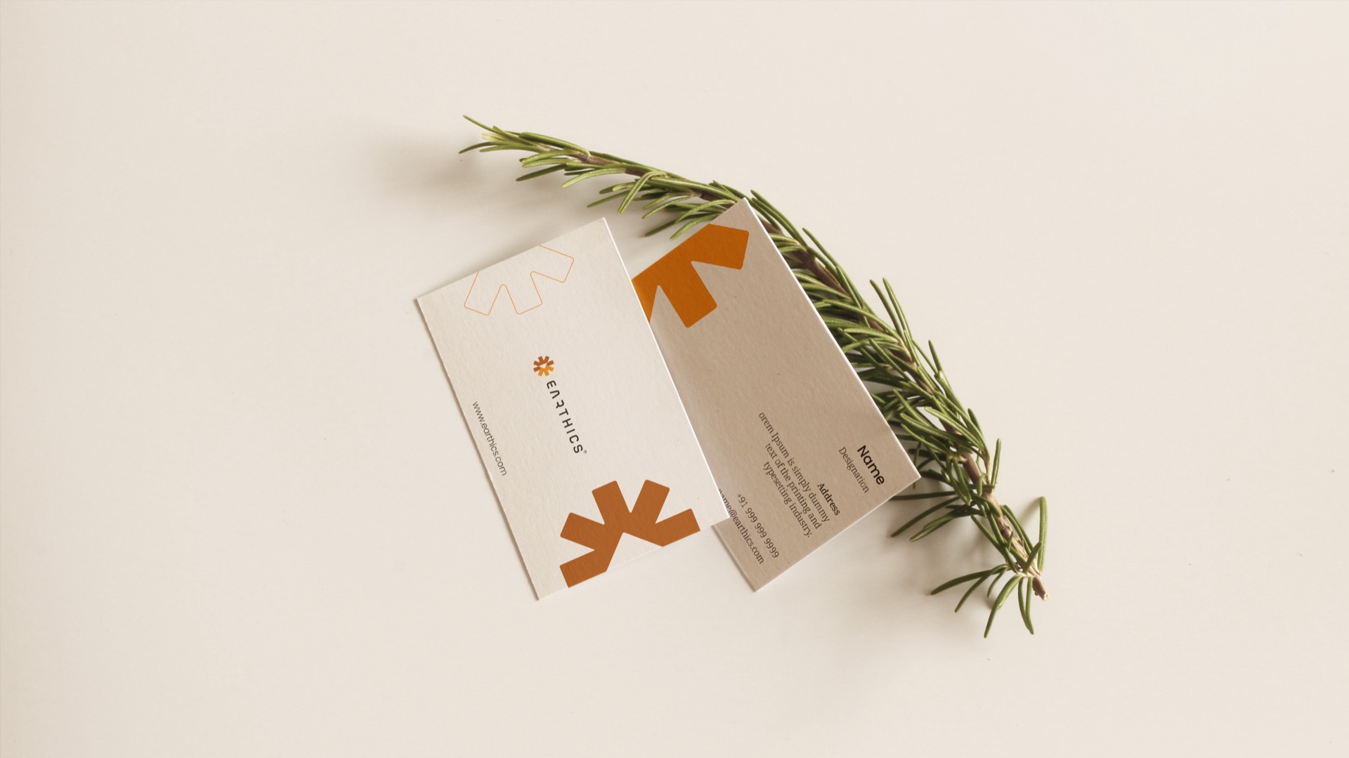
Business cards, envelopes, cups and carry bags - the pattern does the talking, the mark signs off.
04 · Packaging
The first product to wear the brand: a 100-sheet napkin pack in 100% eco-friendly paper. Keep scrolling to pull a few.
The Earthics napkin pack: the front shows the logo, "Soft Tissues, 100 N, 100% eco-friendly paper" and four claims - soft, absorbent, hygienic and quality. The back lists product details and environmental guidance.
Brand guidelines
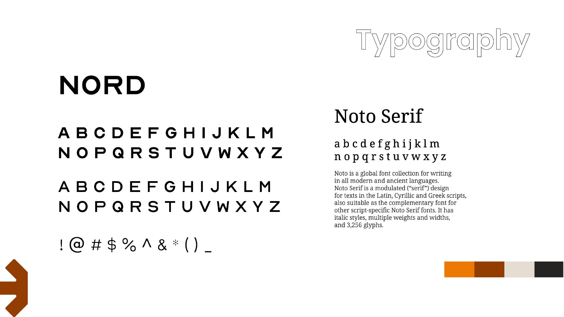
Logo, colour, typography, pattern, stationery and mockups. Drag or click to turn pages, or use the ← → keys.
The outcome
Earthics launched with a name it can own, a mark that works at the size of a favicon or a carry bag, and a system its first product already wears.

 Soft
 Absorbent
 Hygienic
 Quality