Mister Cool
A brand for a fresh-fruit mobile shop - bright, playful and always served with a straw. Flavors of joy.
The brief
Healthy, without the lecture.
Mister Cool is a fresh-fruit startup that serves juices, fruit bowls and smoothies from a mobile shop.
Healthy food usually looks either clinical or earnest. A shop on wheels has seconds to win a passer-by, so the brand had to read like a treat first - loud colour, a friendly name and one simple promise.
Fresh fruit should feel like a reward, not a resolution.
We wrote the strategy, then built the whole identity around the thing every customer walks away holding: a cup with a straw.
01 · The mark
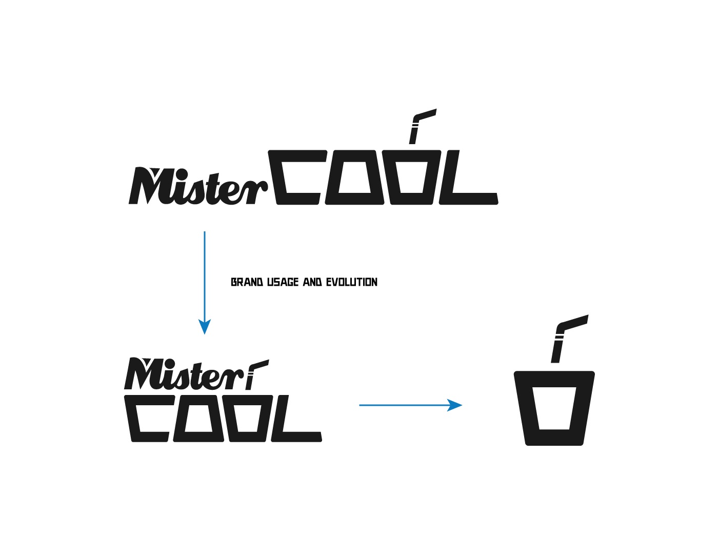
A cup, a straw, a smile.
- The cupA chunky, slightly tapered outline - easy to spot from across the street.
- The strawA bent straw drops in and doubles as the accent on the O of COOL.
- The joyFill it with any fruit: the same cup holds every flavour on the menu.
Mister in a hand-drawn script, COOL in blocky Rekt Solid - a cheeky character with a serious grip.
02 · Identity system
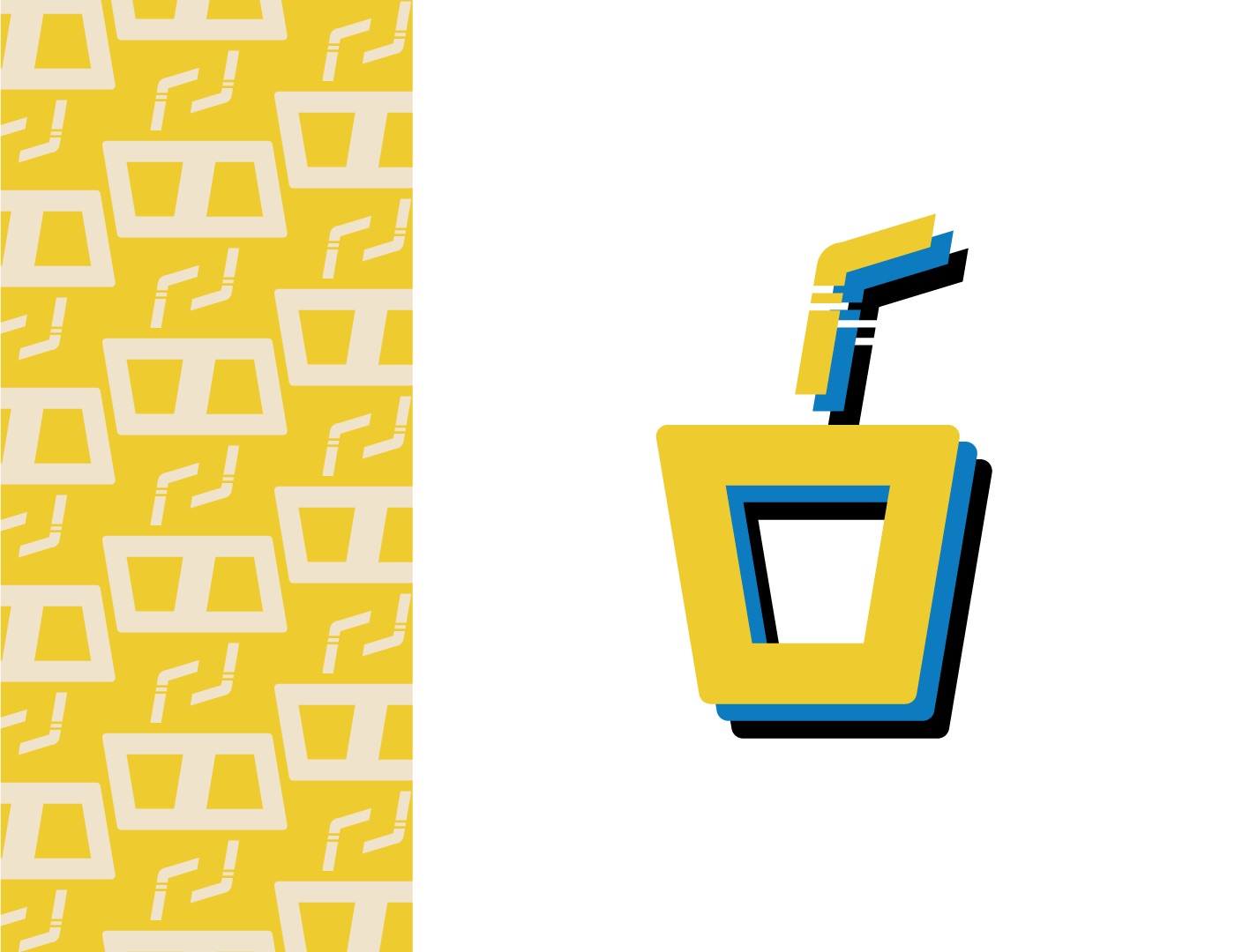
Sunshine yellow, ice-cool blue.
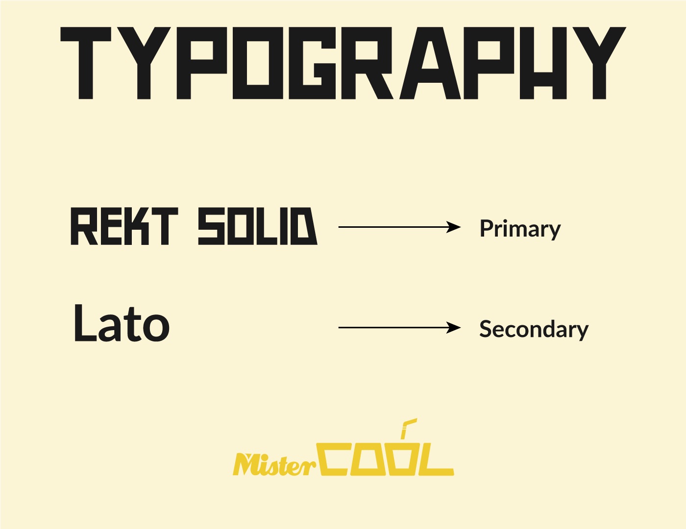
Two primaries for warmth and refreshment, aqua for the splash, cream and navy to rest the eye. Rekt Solid shouts the headlines; Lato does the reading.

Pattern
Fill them all up.
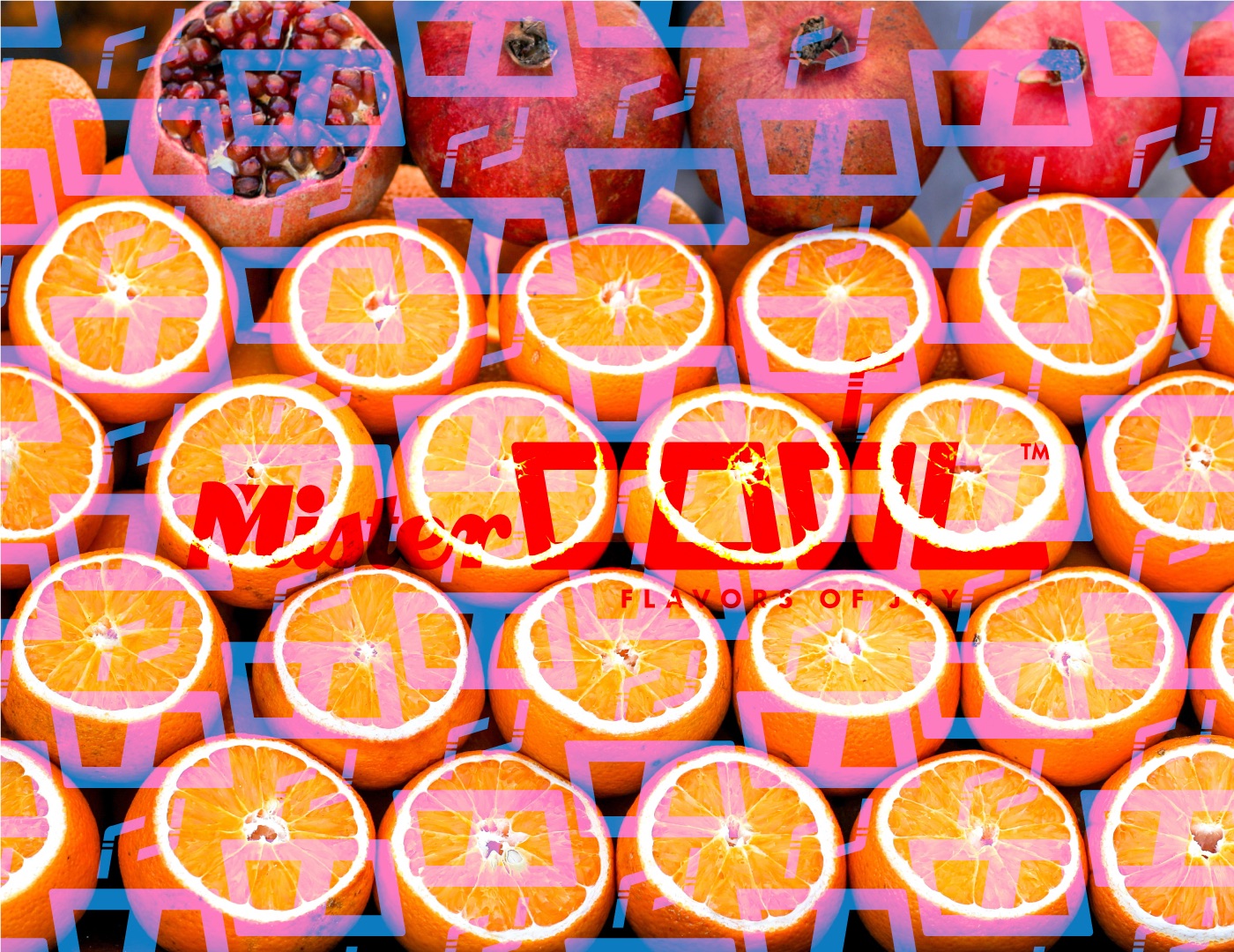
The pattern is made of empty cups. Scroll, and the whole grid fills with juice, one wave at a time.
03 · The mobile shop
Joy, on wheels.
- Rolls inThe cart is the billboard - blue body, yellow skirt, the logo big on the side.
- Opens upA striped awning and a cream counter turn any corner into a juice bar.
- ServesCups line up in brand colours, with the day's menu on the board.
Illustration of the brand applied to a mobile shop, drawn for this case study.
04 · Packaging
Grab it, sip it, smile.
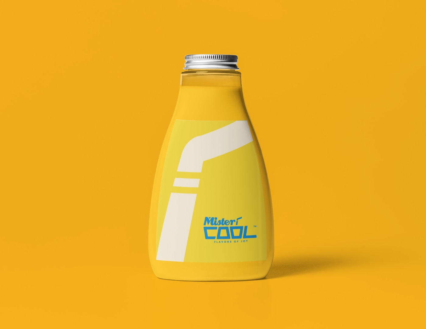
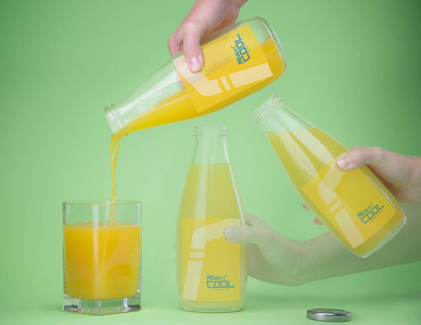
Bottles and cups carry the straw stripe and the pattern, so every serving advertises the shop it came from.
Takeaway cup mockup
05 · In the world
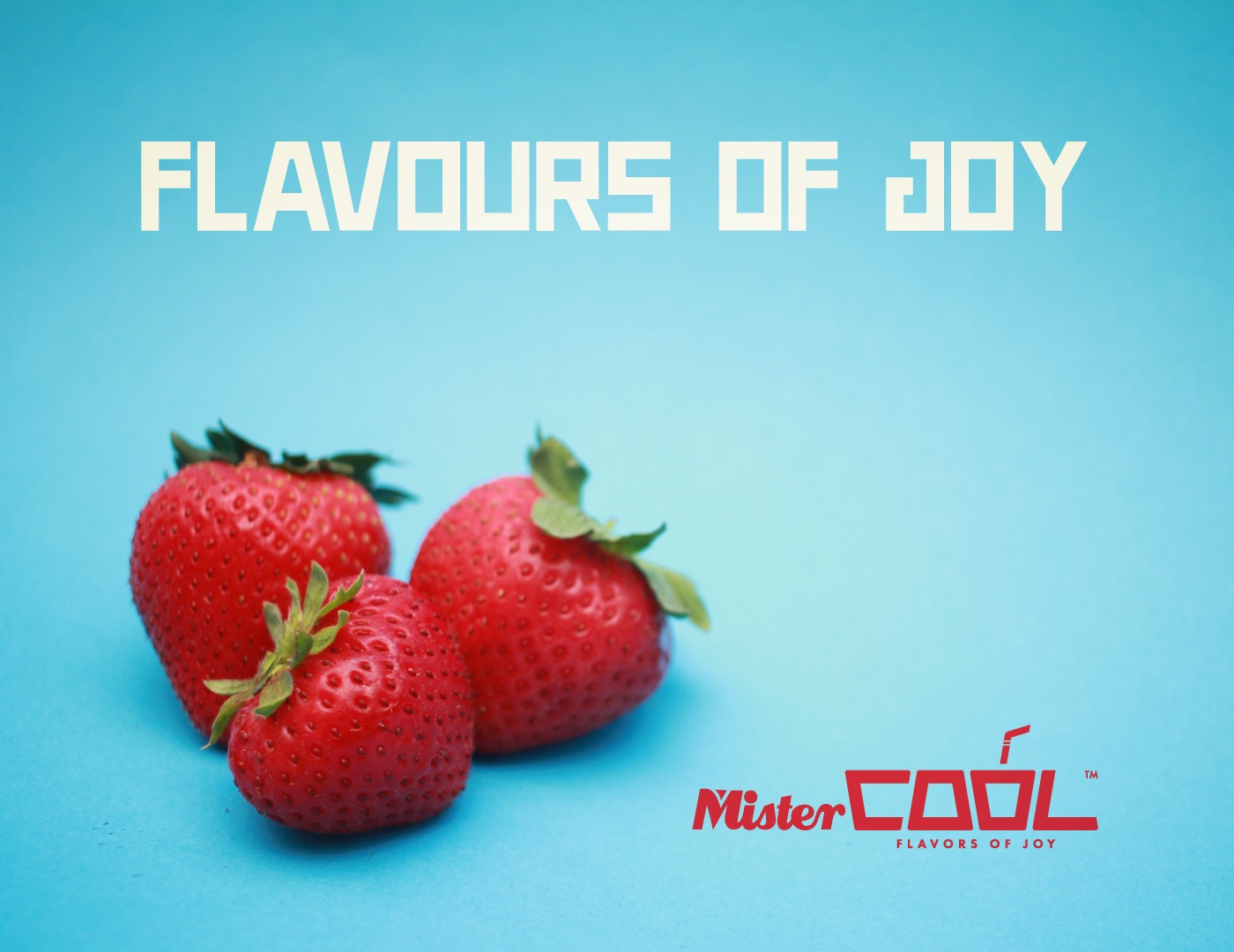
Fruit first, logo second.
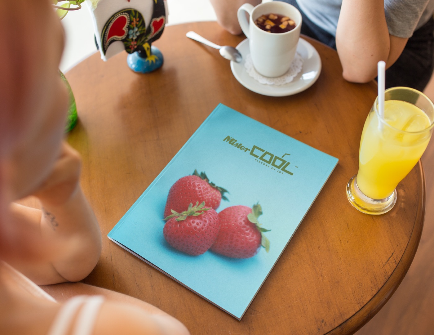
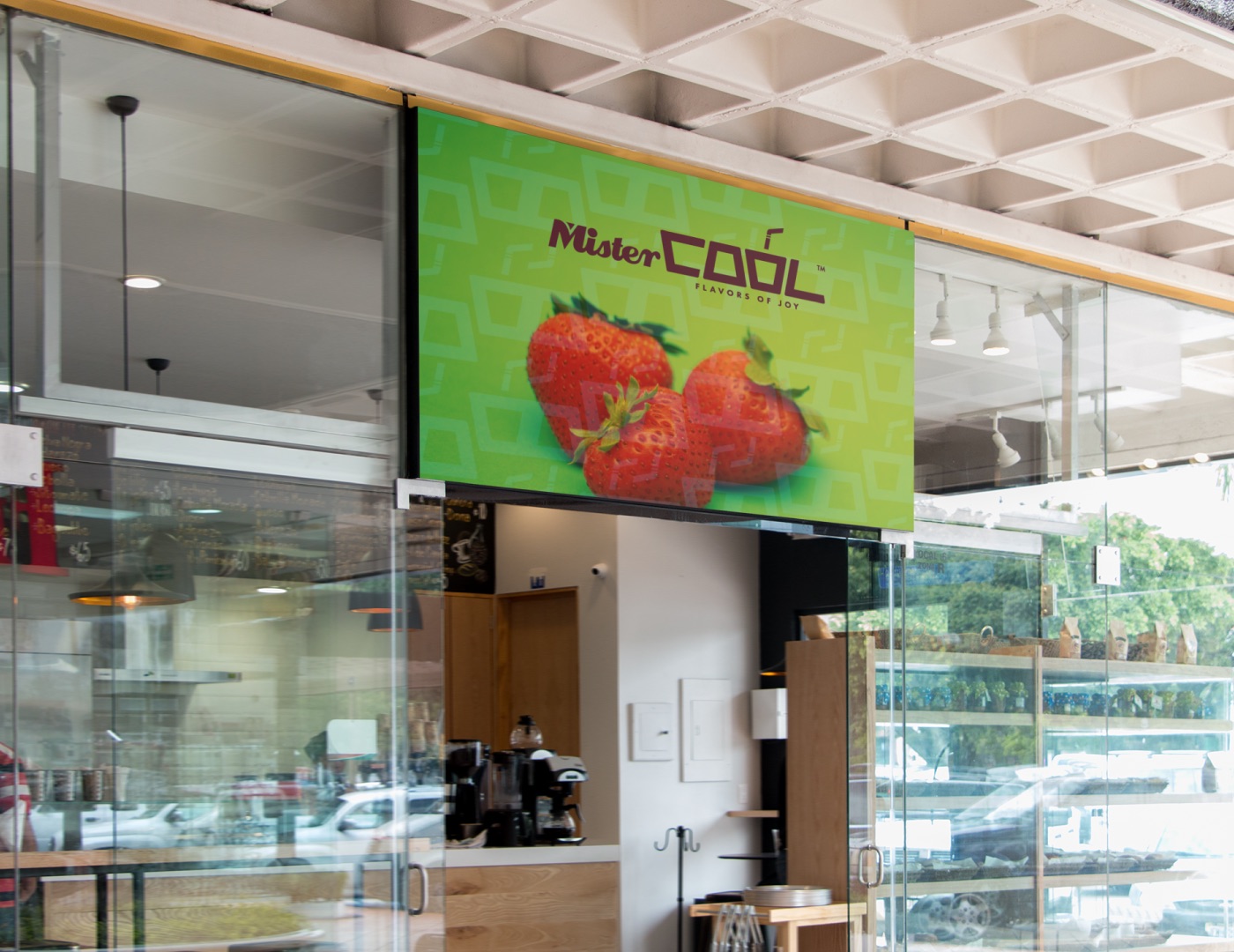
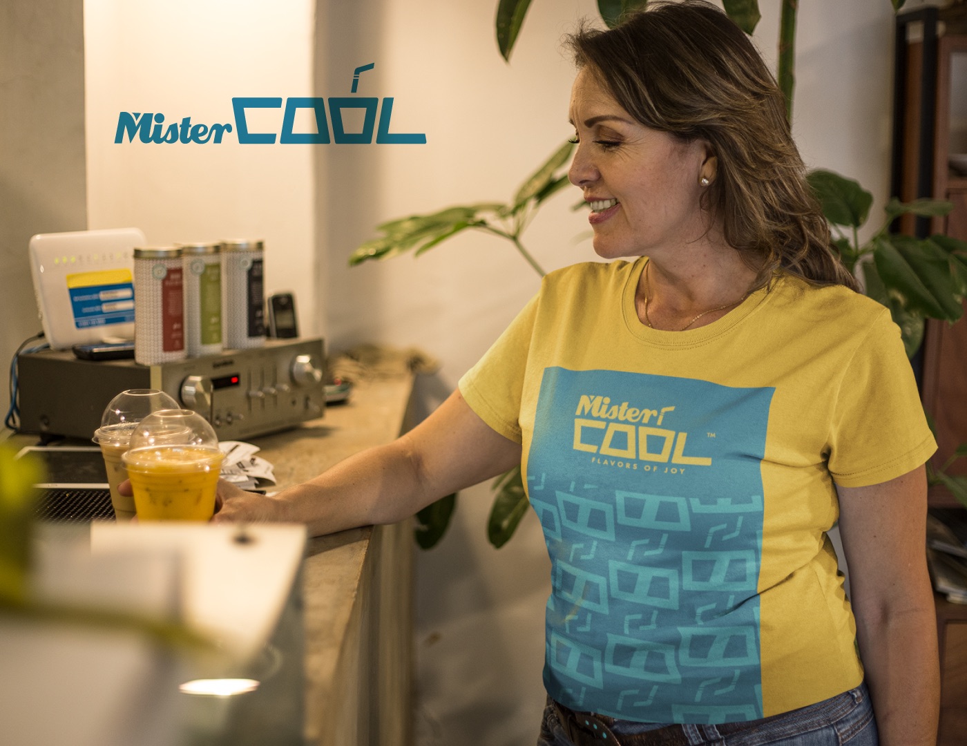
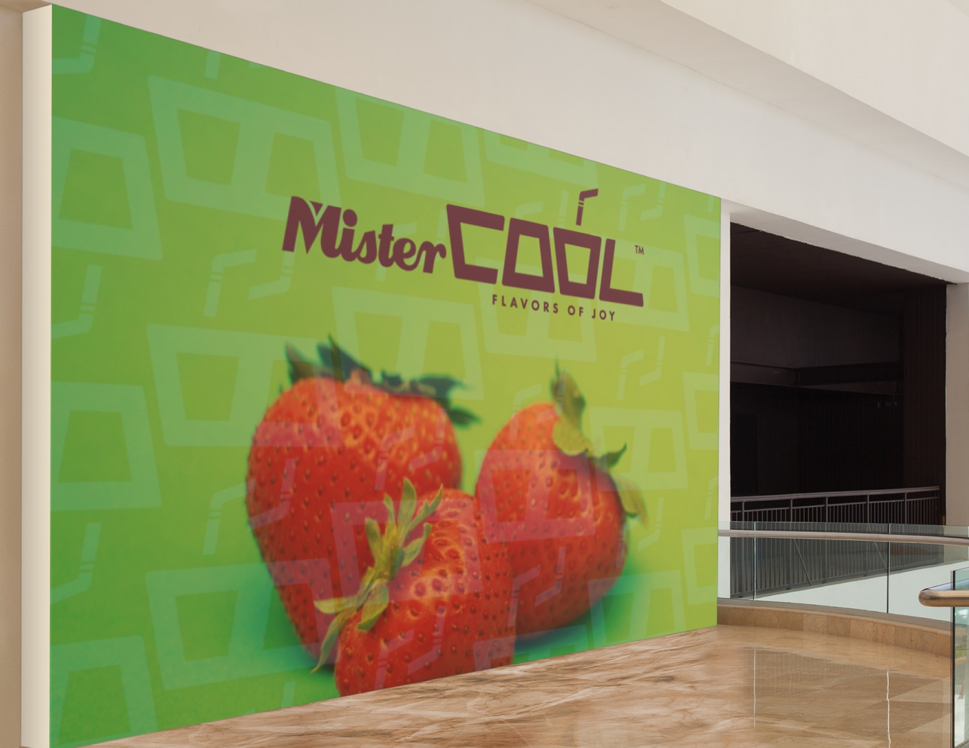
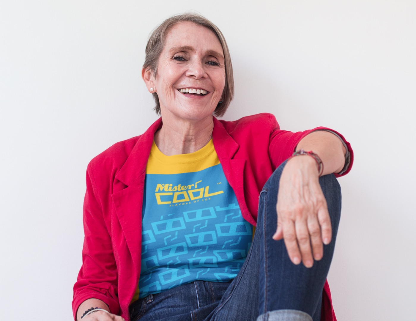
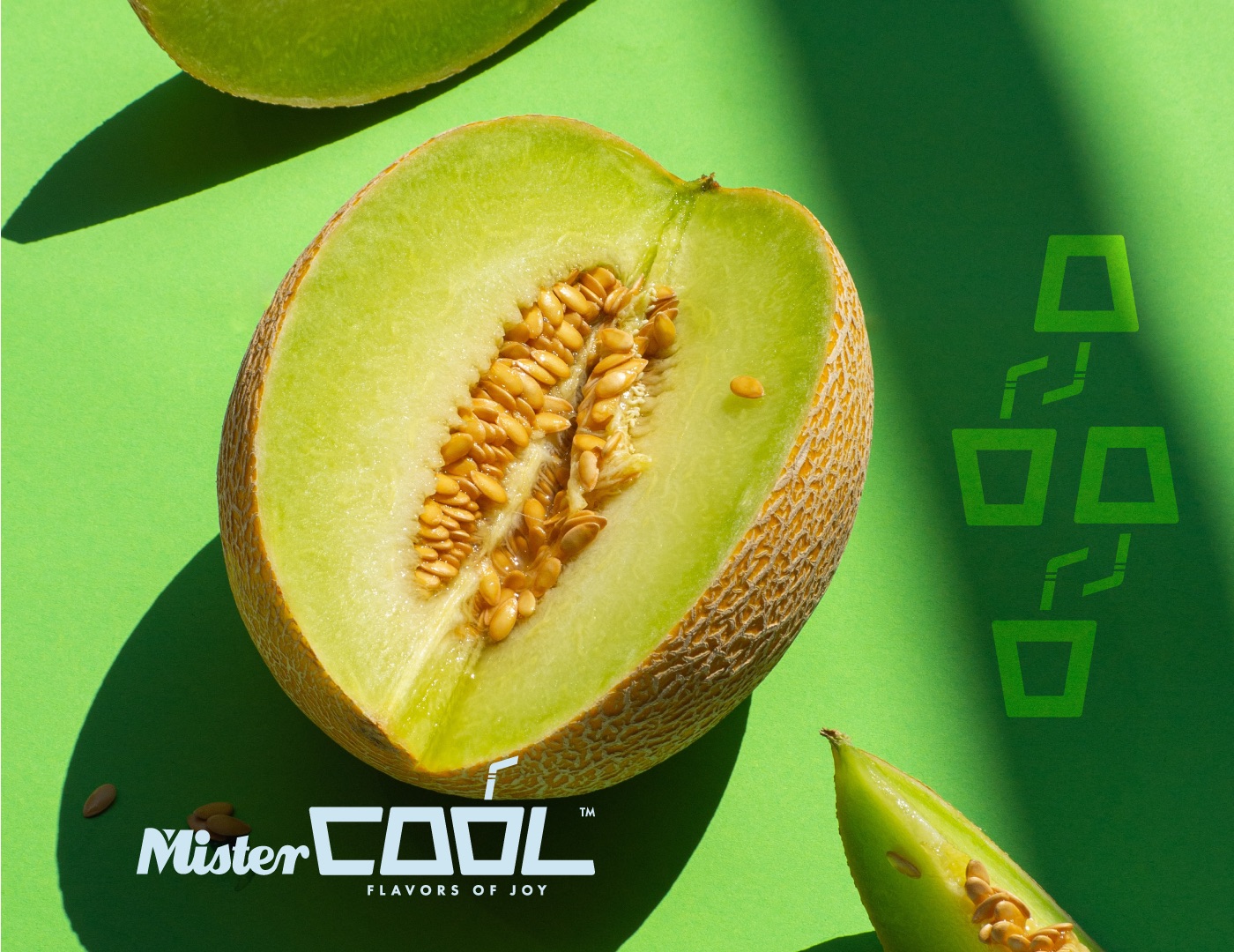
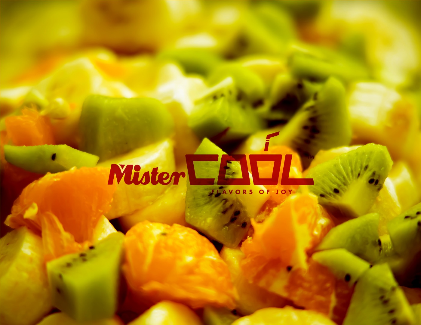
Campaign images let the fruit do the selling, with the logo signing off - on screens, walls and the team's own t-shirts.
06 · Print & merch
Small things, big smiles.
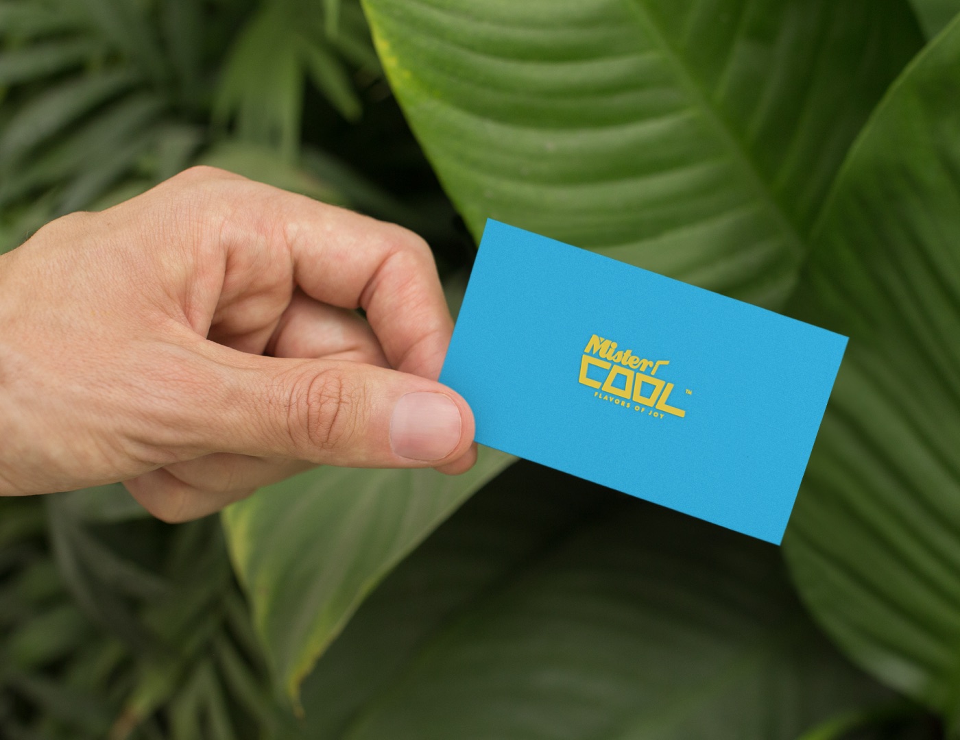
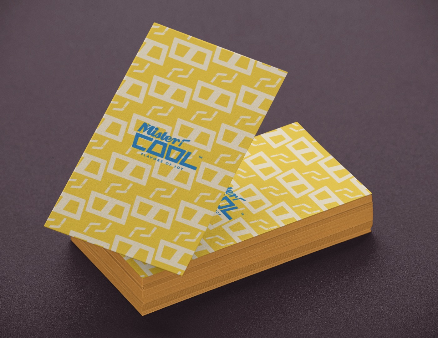
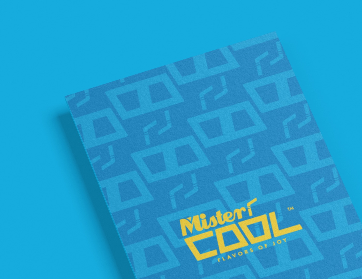
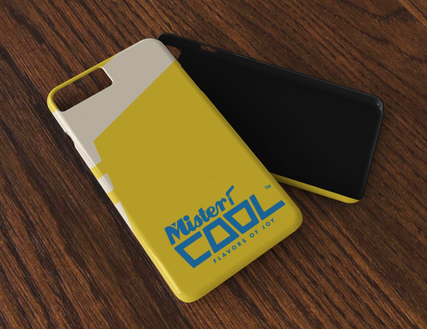
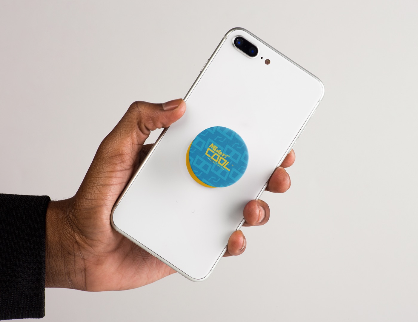
Cards, notebooks and phone accessories in the same two colours - the pattern makes even the back of a card recognisable.
Brand guidelines
The whole system, page by page.
Logo, colour, type, pattern and applications. Drag or click to turn pages, or use the ← → keys.
The outcome
A brand you can taste.
Mister Cool launched as a brand people smile at before they have read a word - one cup, two colours and a name that does the selling.
Designed with Burri Keerthi.
- Brand strategy and positioning
- Logo, cup mark, colour and typography
- Pattern and packaging
- Print, merchandise and campaign visuals