SKU 01 · Face serum
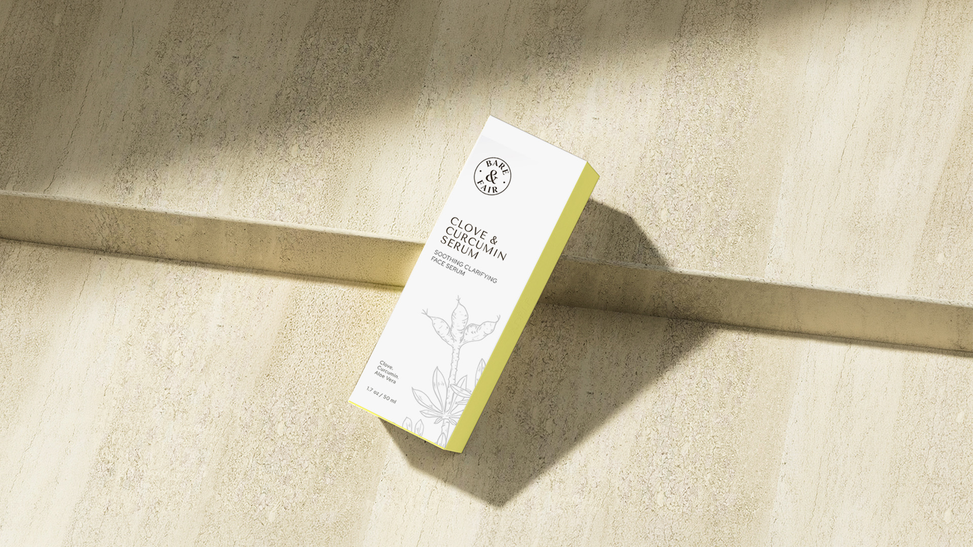
Clove & Curcumin Serum
Soothing, clarifying face serum.
Packaging for a Canadian botanical skincare line - three products, three colours and one calm system that lets the ingredients speak first.
The brief
Bare & Fair makes skincare from time-tested botanicals - curcumin, clove, saffron, turmeric and rose.
Their first three products needed packaging that felt clean and trustworthy on the shelf, carried every claim in English and French, and could grow into a wider range without starting again.
The ingredients are the story - so everything else steps back.
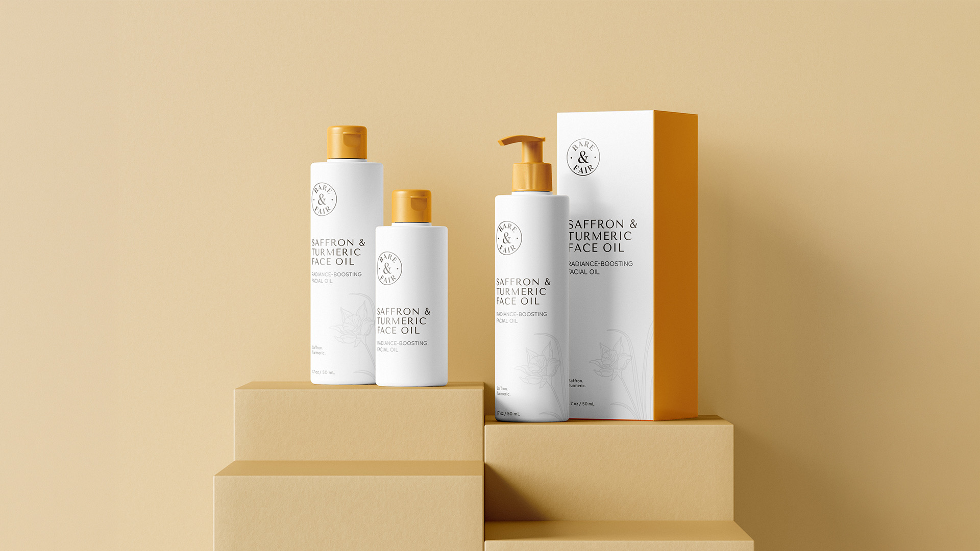
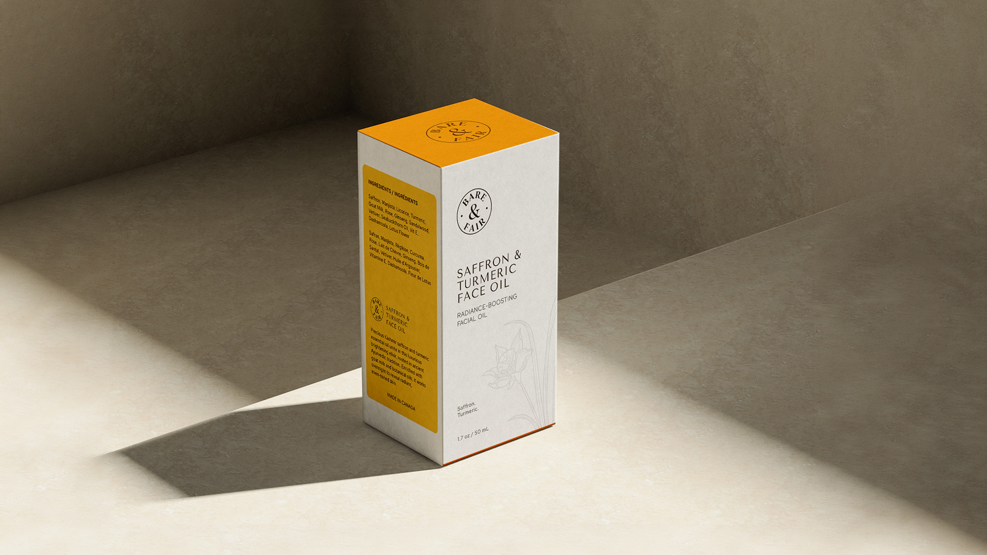
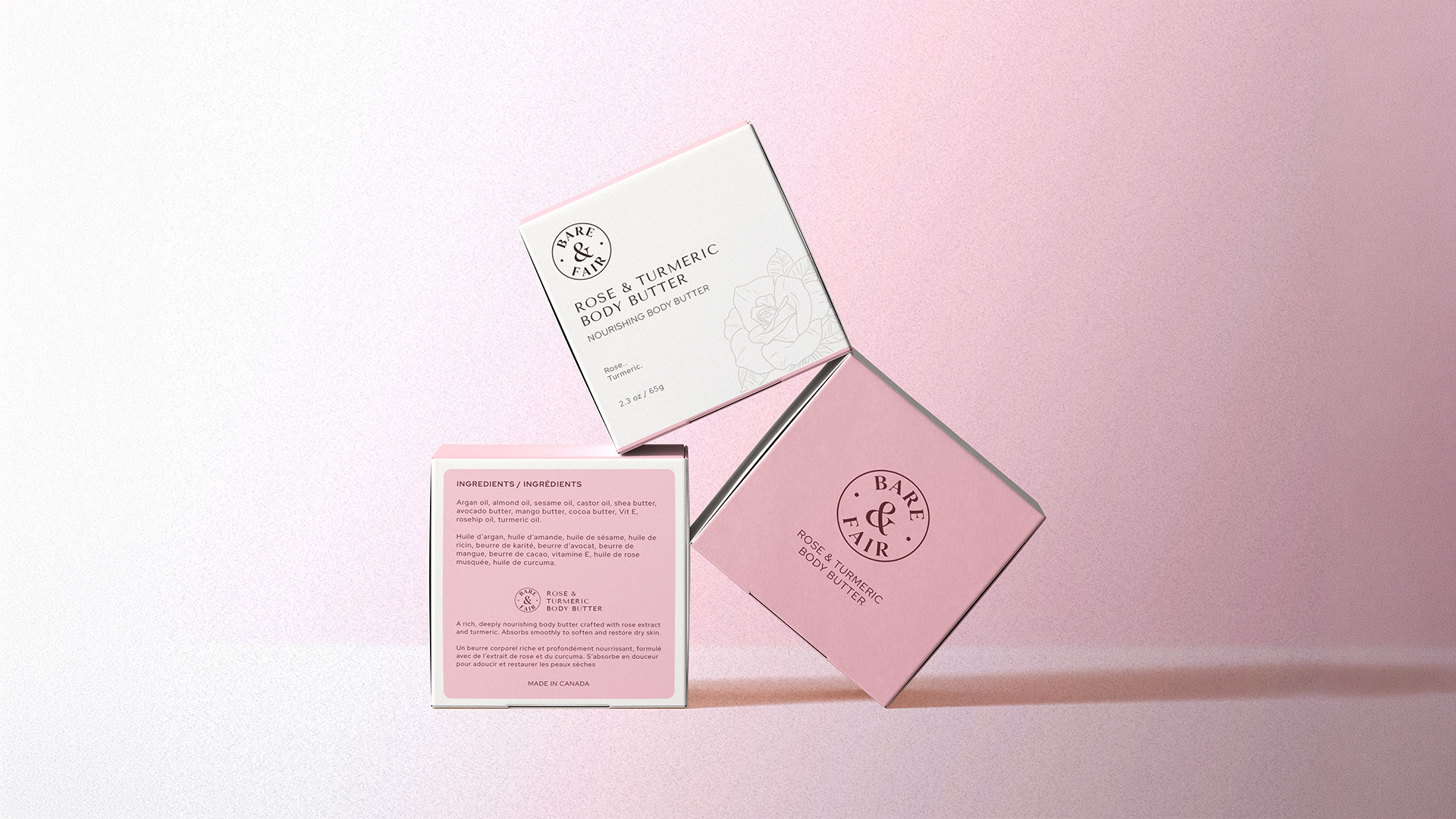
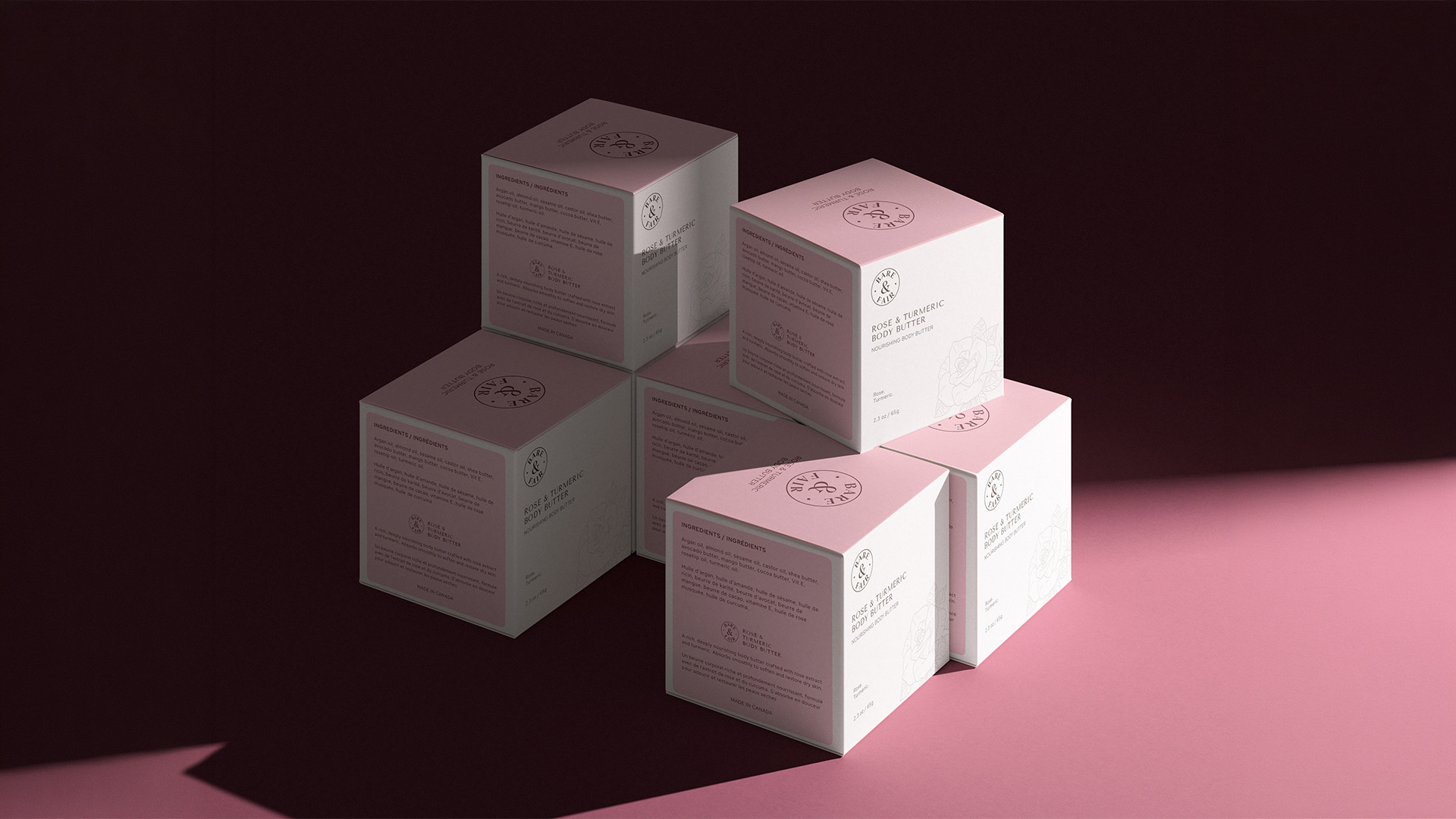
Each carton leads with one hand-drawn botanical and one colour. The seal, type, icons and layout stay identical, so the range reads as a family from across the room and as three distinct products up close.
The range
SKU 01 · Face serum
Soothing, clarifying face serum.
SKU 02 · Facial oil
Radiance-boosting facial oil.
SKU 03 · Body butter
Nourishing body butter.
Structure
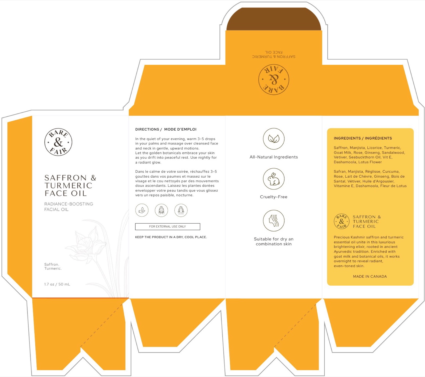
Every carton starts as a dieline: four panels, a tuck-top lid with the seal, and a snap-lock base. The artwork is laid out so the front, claims and ingredients each land on their own face.
The carton
Built from the real print files. Drag to rotate, or switch products to compare the three cartons.
In the world
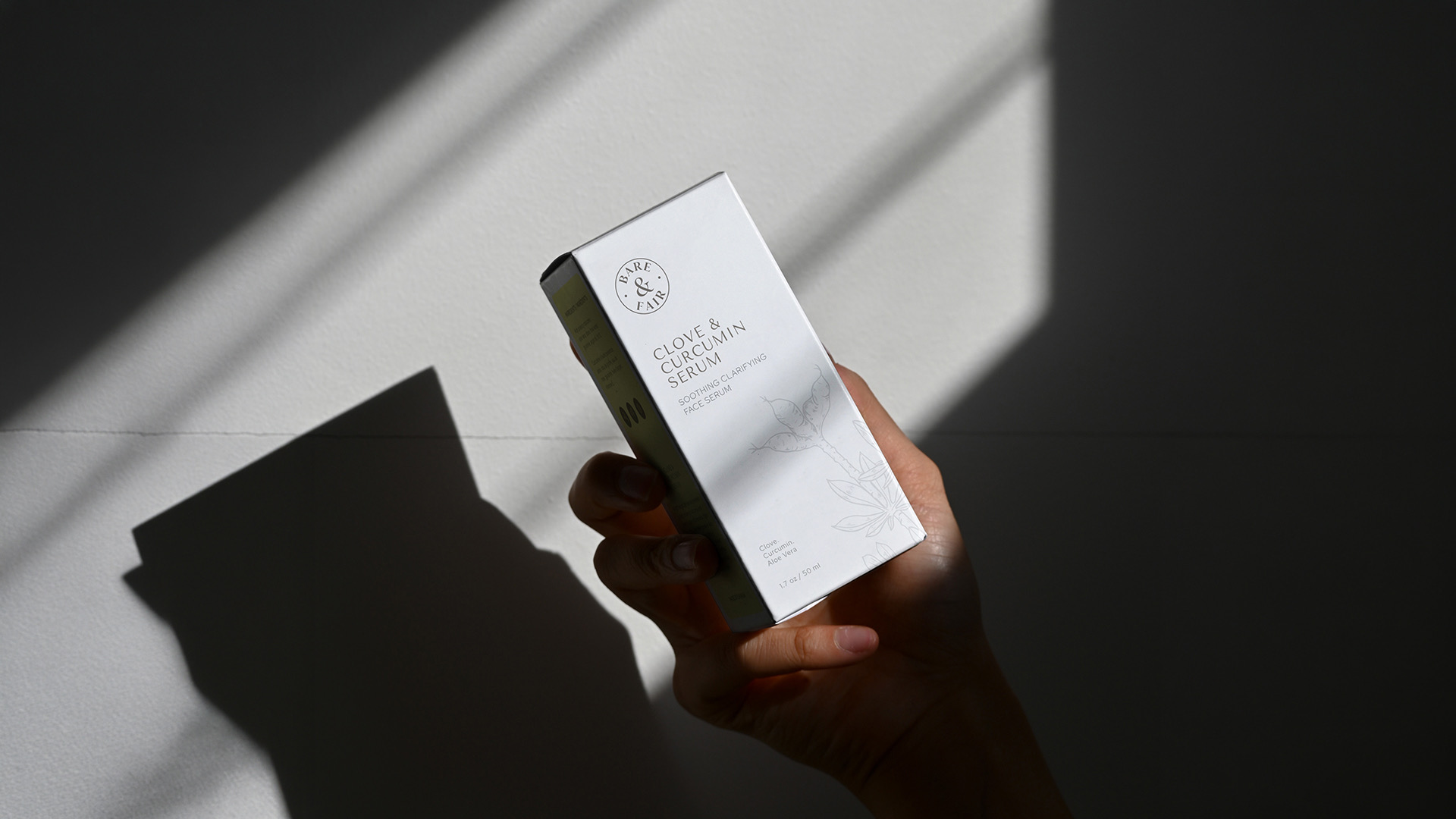
Soft daylight and plain plinths keep the focus on the cartons, the way the packaging keeps the focus on the ingredients.
Showcase book
Each spread pairs a print-ready dieline with its finished carton. Drag or click to turn pages, or use the ← → keys.
The outcome
Bare & Fair launched with three cartons that feel like one brand. A new product only needs a botanical and a colour - the system does the rest.