Meaning
Rooted in the Russian word for luxury. It says premium without saying "premium".
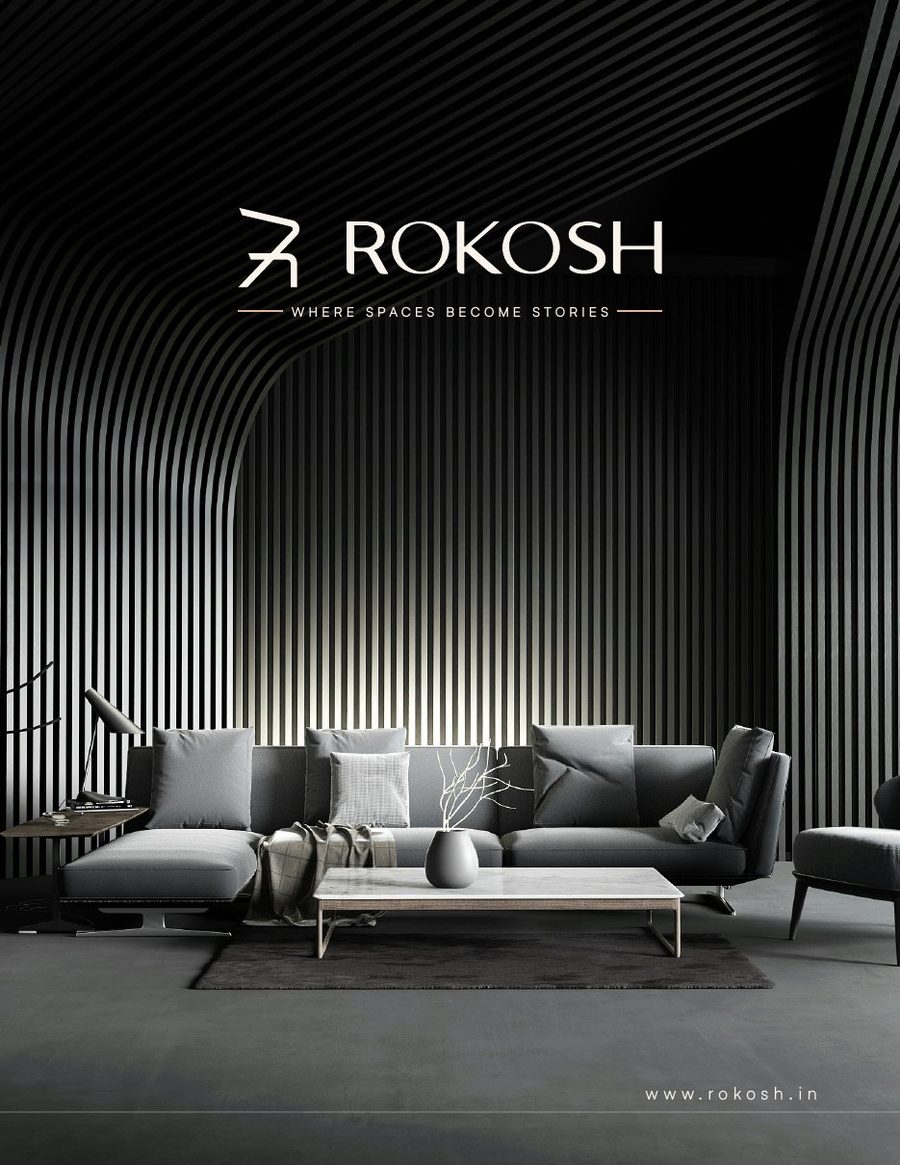
Name, identity and every touchpoint for a luxury interiors and modular furniture maker. Where spaces become stories.
The brief
Design, European machinery and installation under one roof - kitchens, wardrobes, beds and custom furniture for homes and workplaces.
The team had the craft: automated cutting, edge banding and drilling, premium laminates, veneers and lacquered glass. What they did not have was a brand. No name, no mark, nothing that told a homeowner or an office manager that this was quiet luxury, built to measure.
We bring your dreams to reality. Dream it - we do it.
We started from zero: a name, then a mark drawn from two thin lines, a green-and-copper palette, full guidelines, and the brochure, deck and website that sell it.
01 · Brand Naming
Scroll to narrow the list
Meaning
Rooted in the Russian word for luxury. It says premium without saying "premium".
Sound
Two hard syllables and a soft finish. Short, sharp and easy to remember for a high-end design firm.
Checks
Every candidate went in with its domain search. ROKOSH had a clean .in, ready to register.
02 · The mark
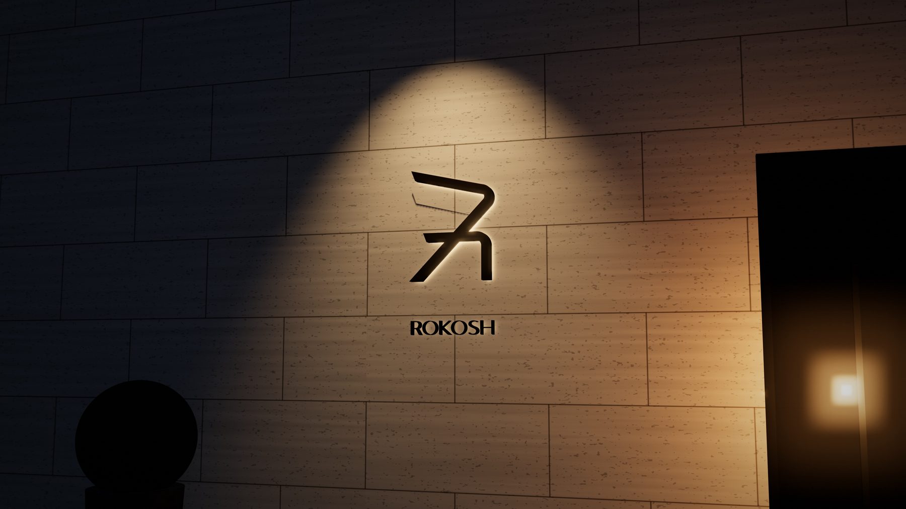
An R that leans forward like an arrow. Sharp, thin lines with a little roundness at the corners, set at 13° and 46° - the precision of a CNC cut, softened by hand.
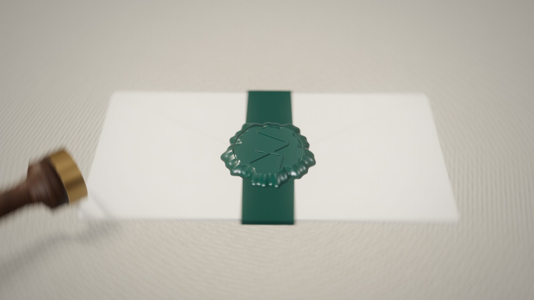
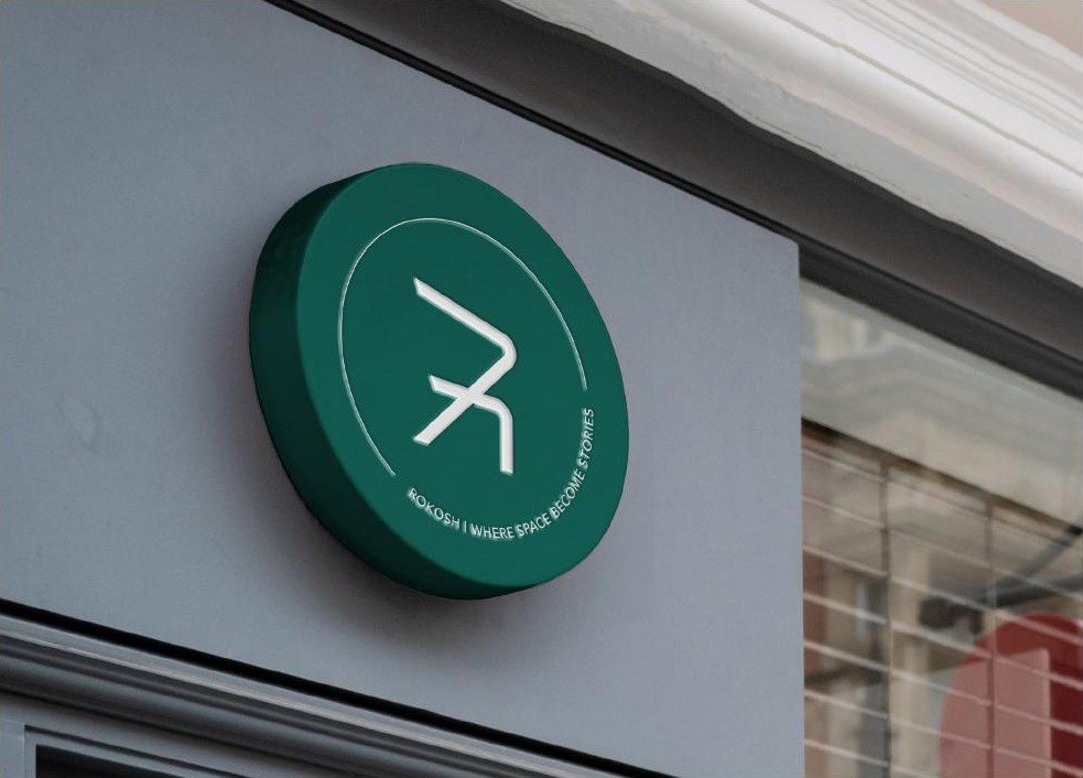
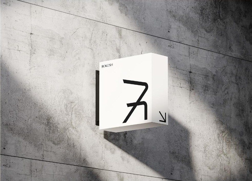
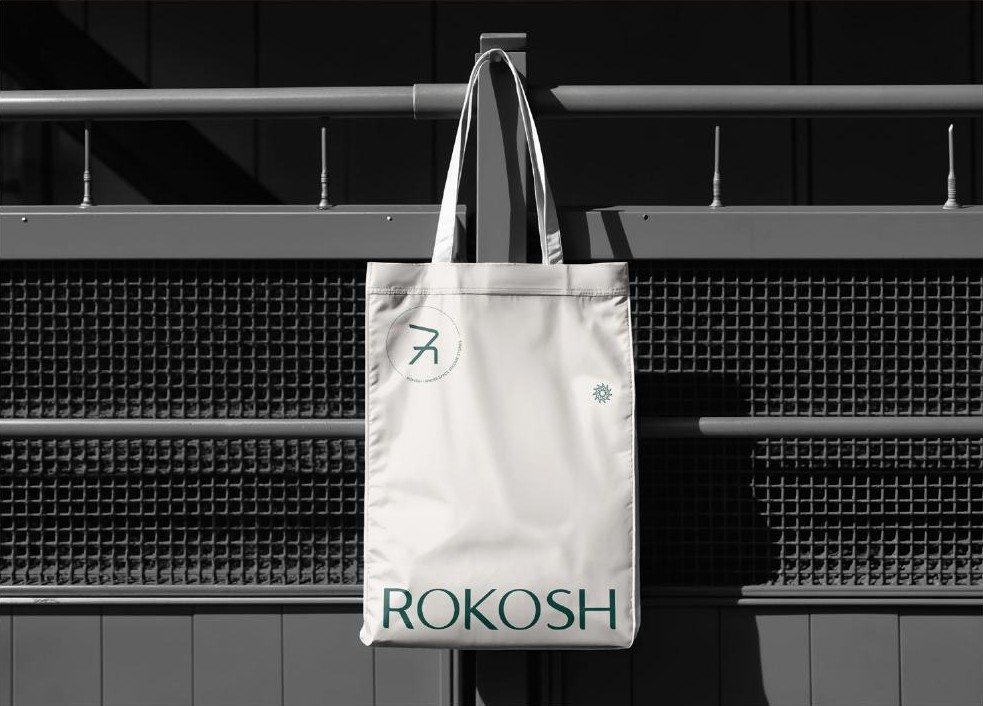
The mark becomes a seal for the places a wordmark will not fit: signage, stamps and the back of every card.
"Where spaces become stories" runs around the edge. Scroll and it turns.
03 · Identity system
Green carries the brand. Copper tones are used sparingly, for highlights and calls to action, and white keeps everything calm.
Colour balance
White does most of the work, green anchors it, copper is the accent.
Specialty tints
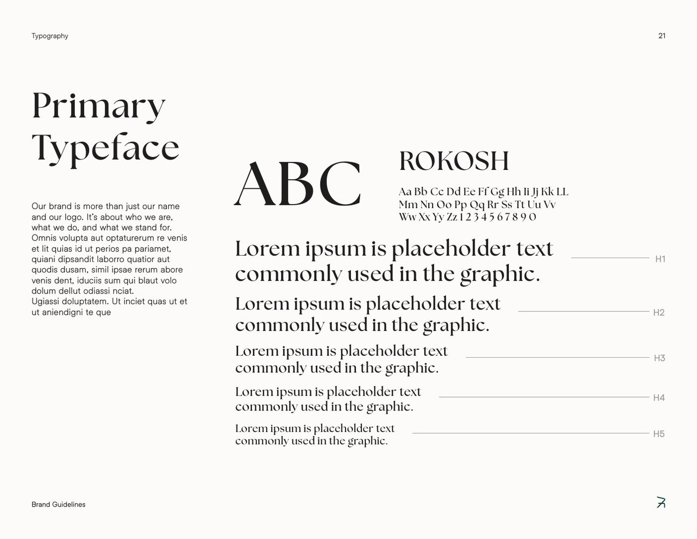
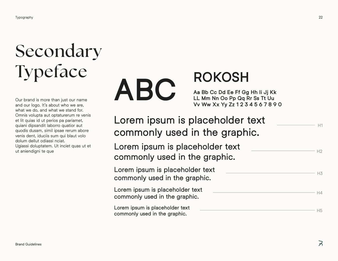
Pattern
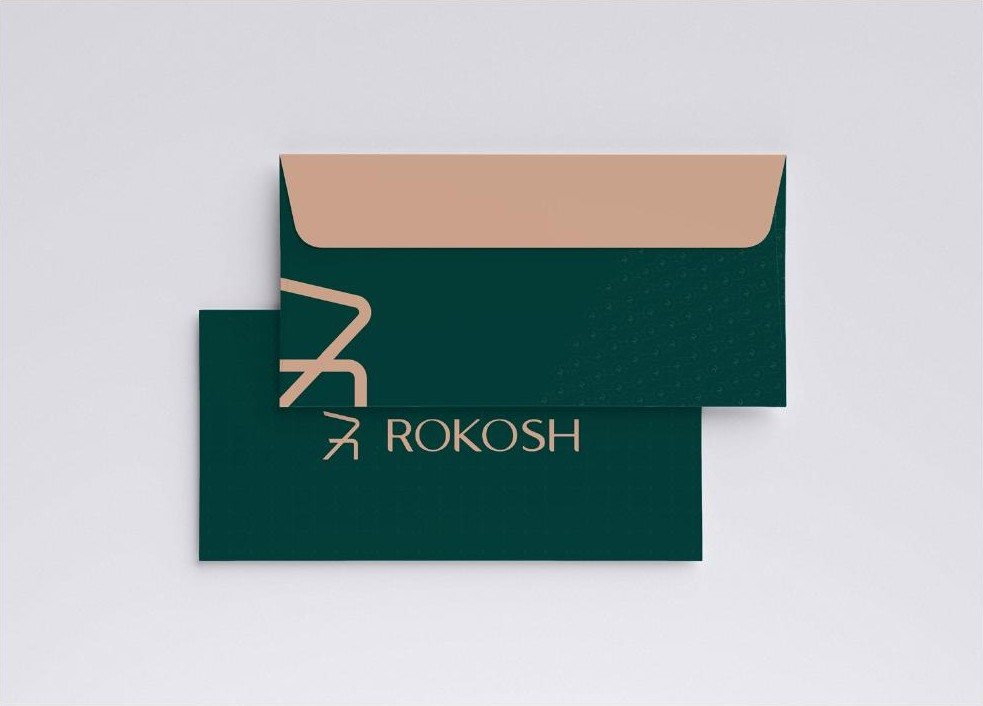
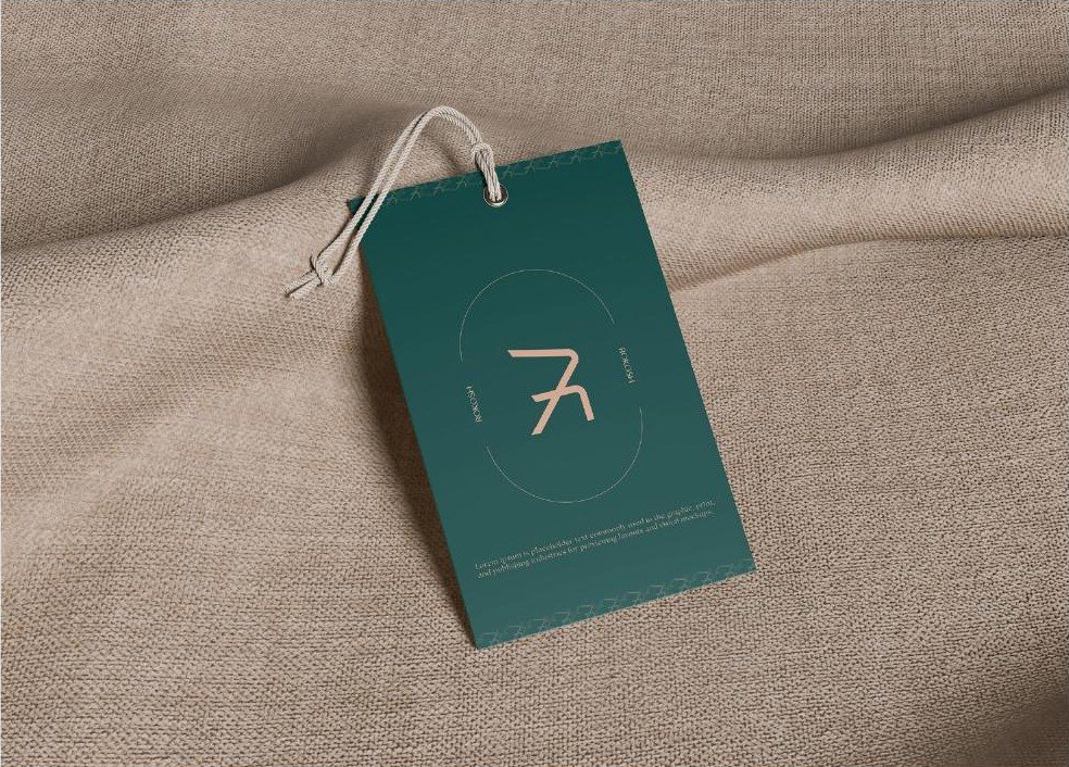
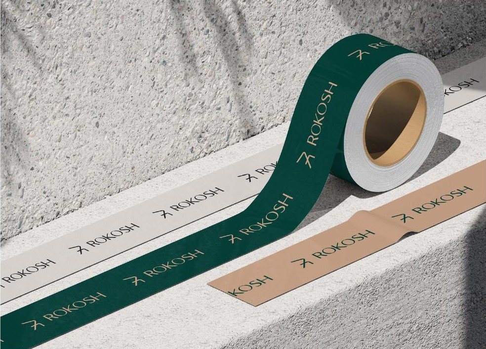
Built on a square tile and turned on the canvas, it lines envelopes, card backs, tape and the website footer.
04 · The story
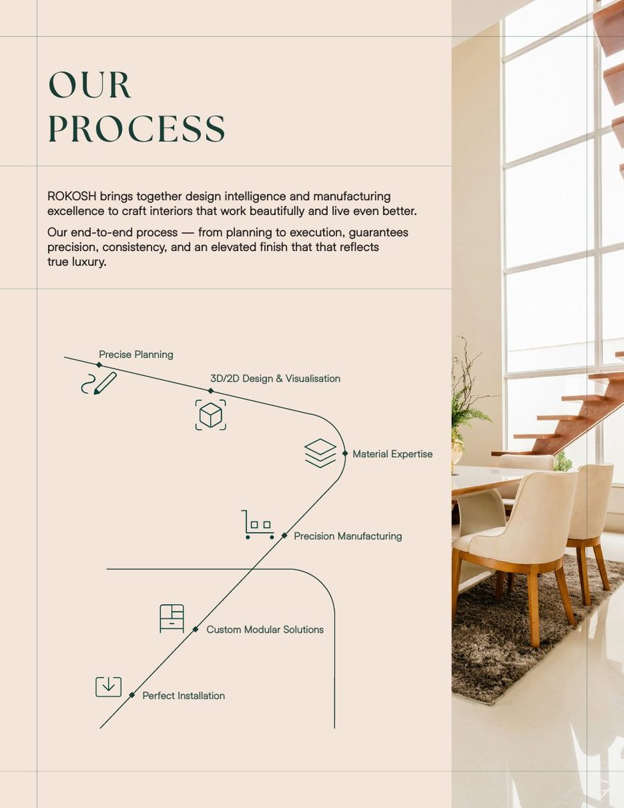
The brand had to explain an end-to-end promise in one glance. We drew it as a single line, the same line as the mark.
05 · Applications
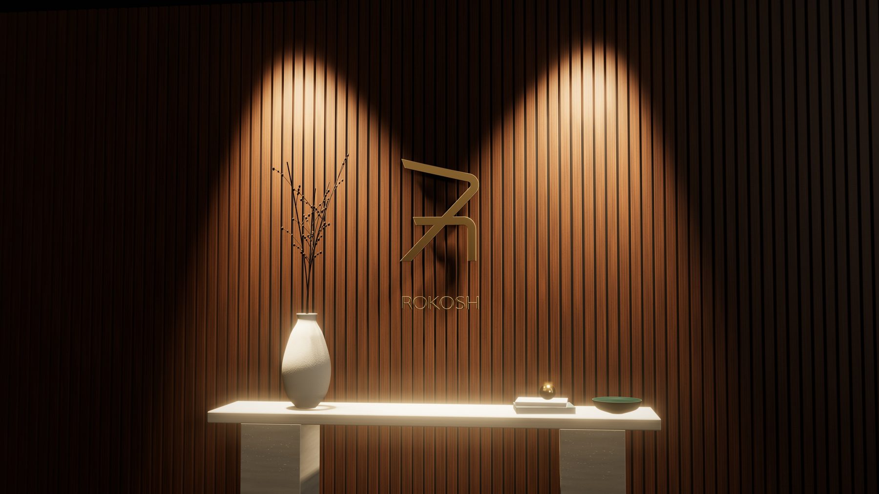
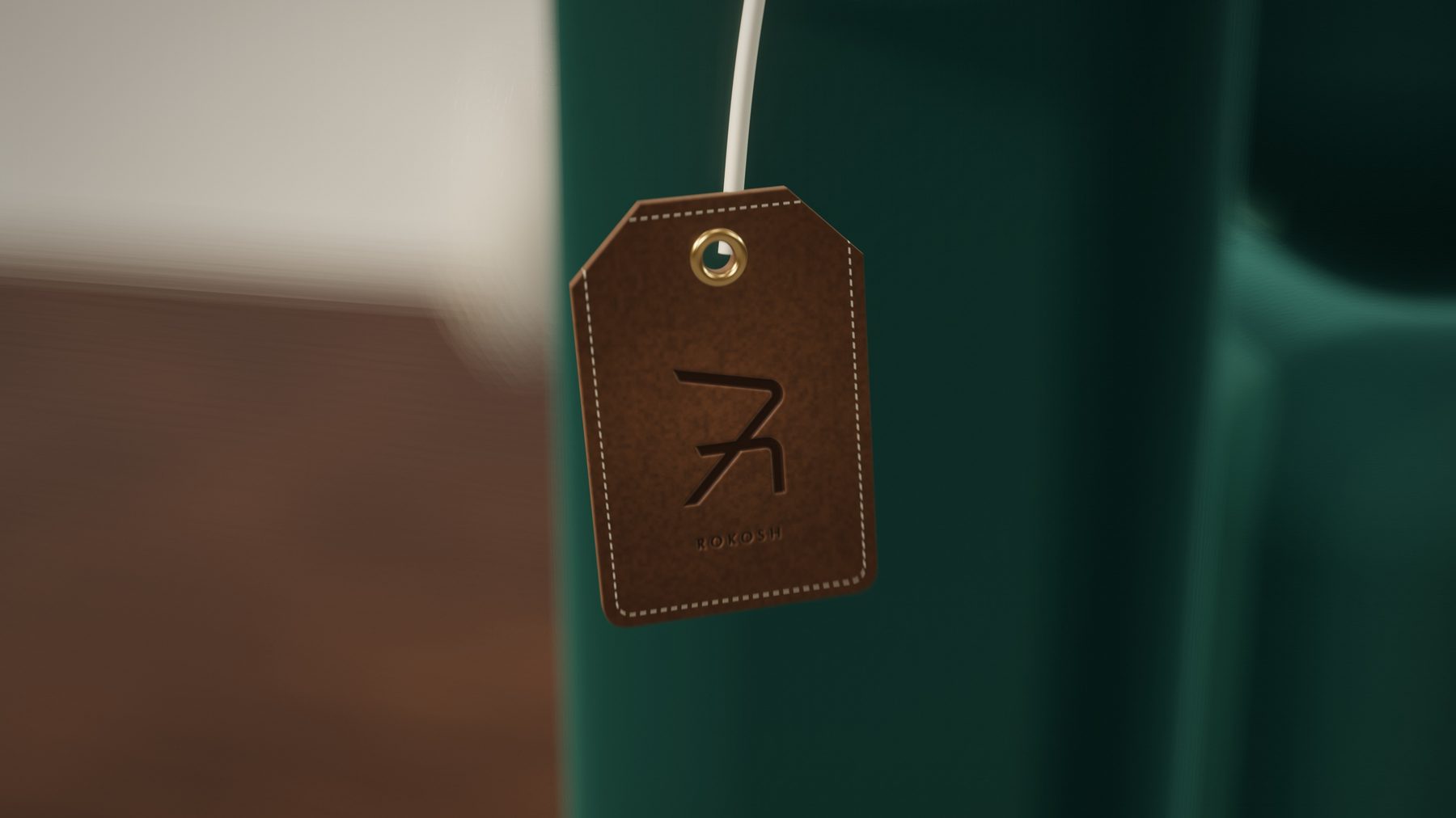
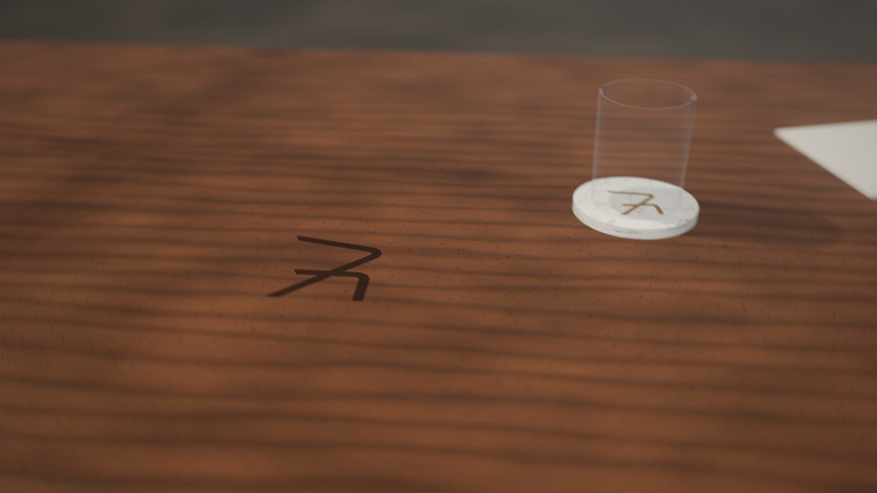
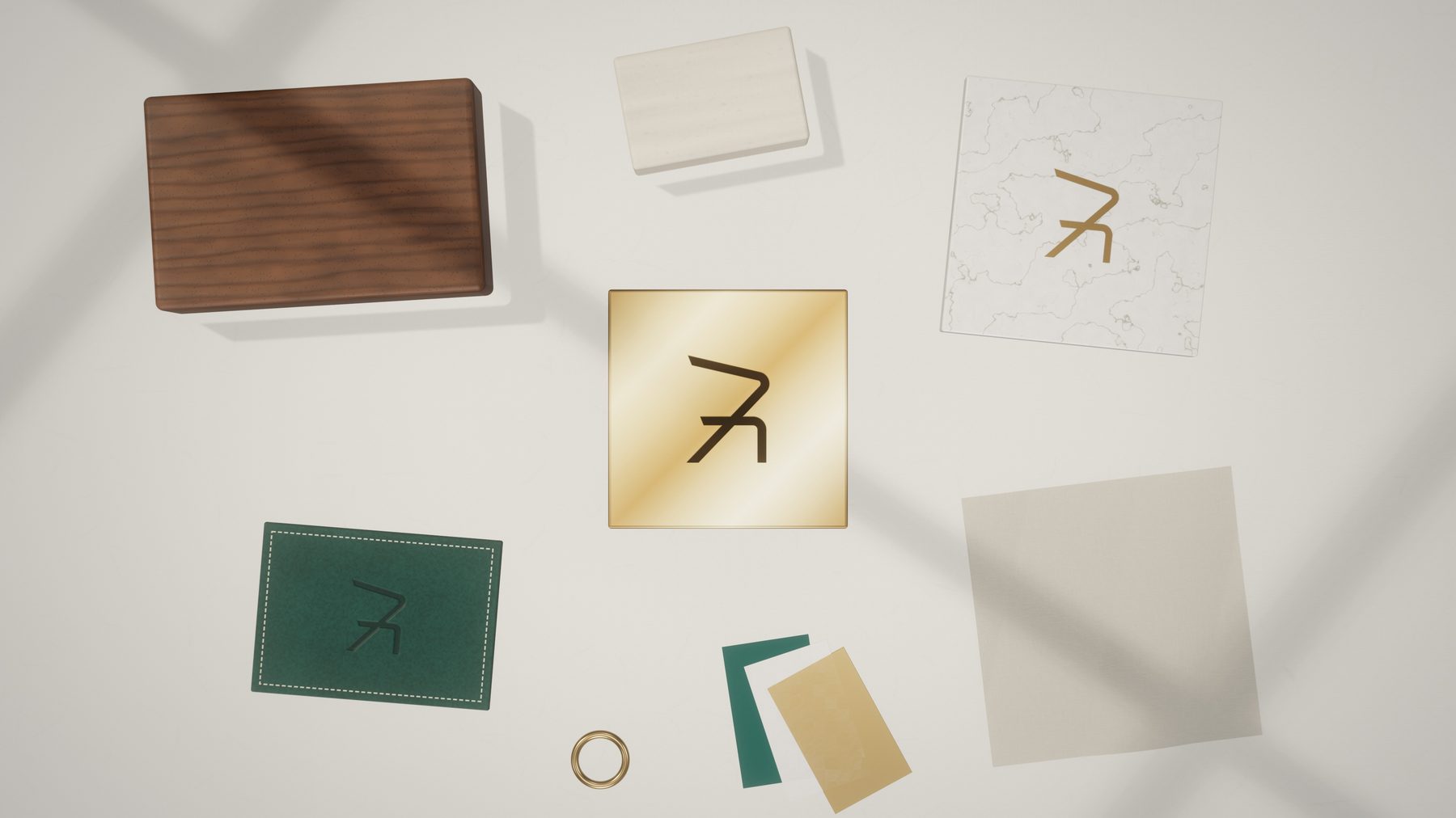
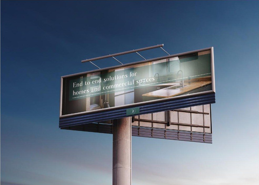
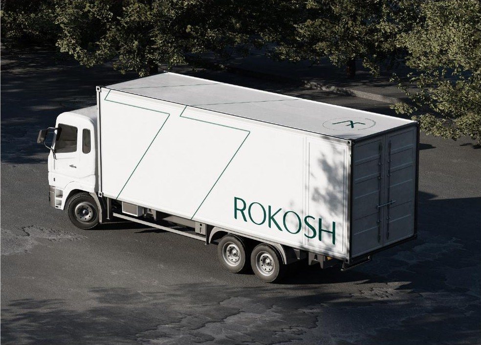
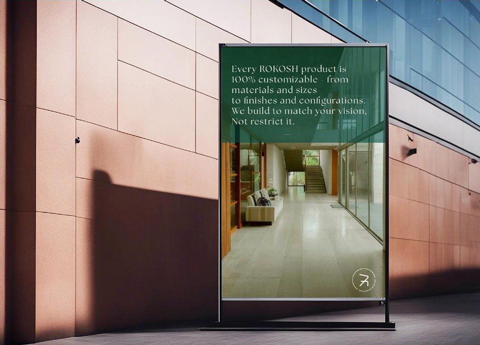
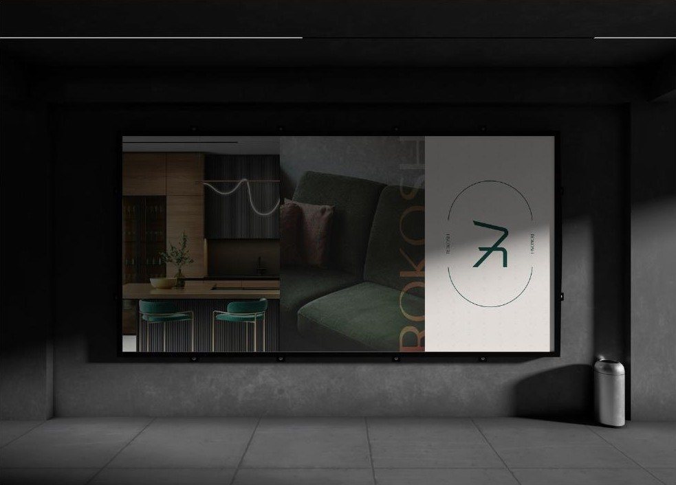
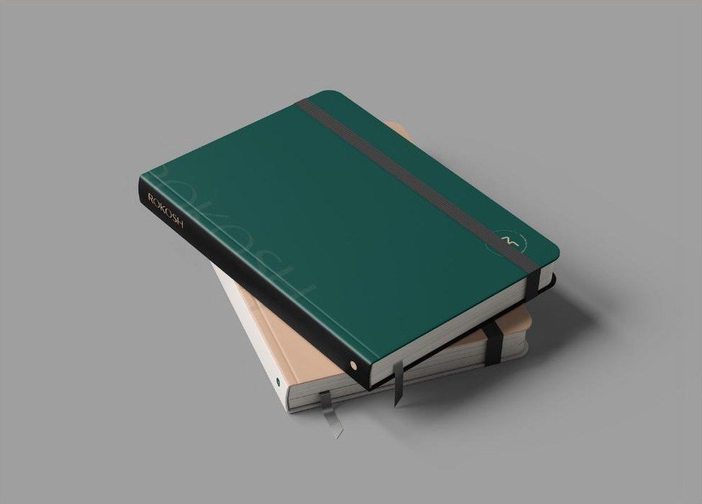
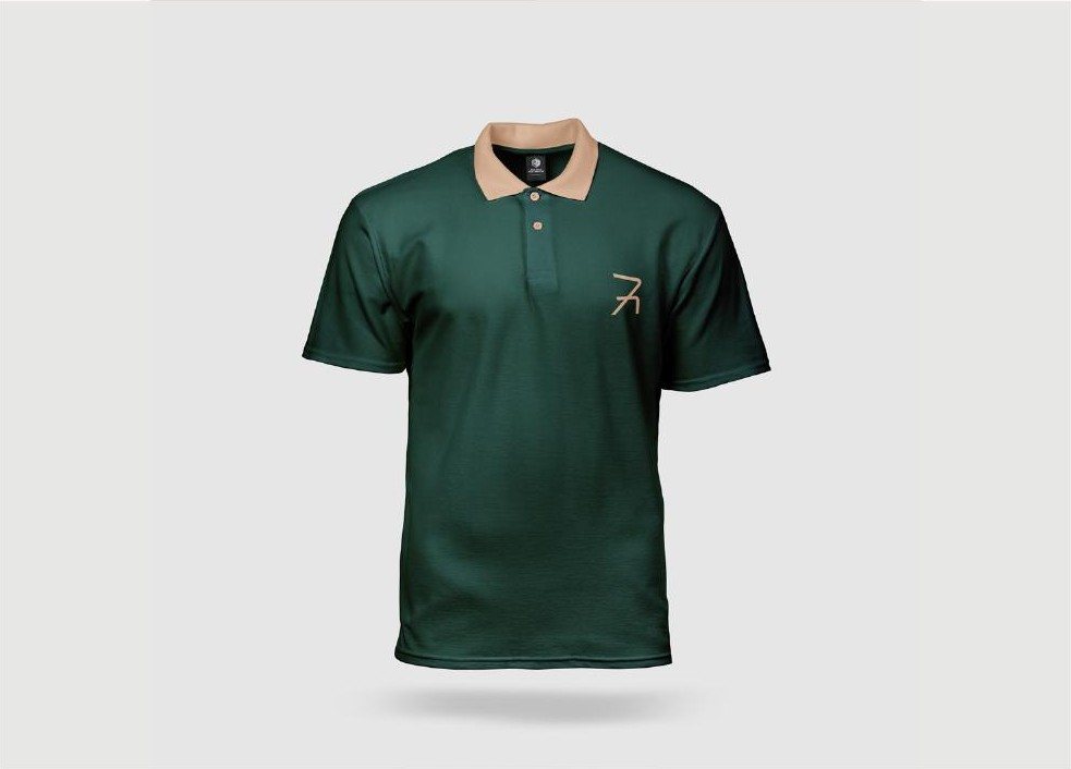
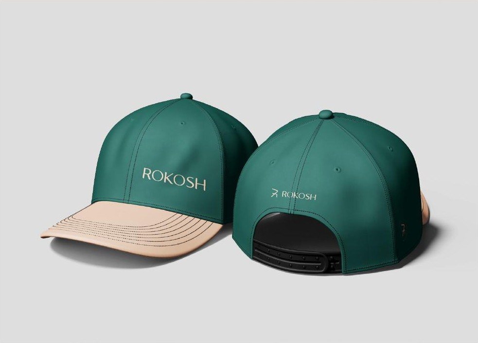
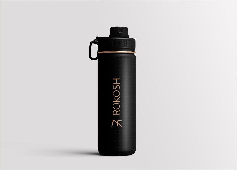
We rendered the mark in the materials ROKOSH works with - brass tube, walnut, leather, travertine - then took it onto signage, stationery, uniforms and the delivery truck.
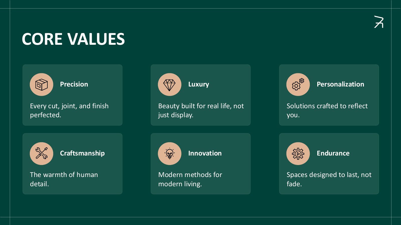
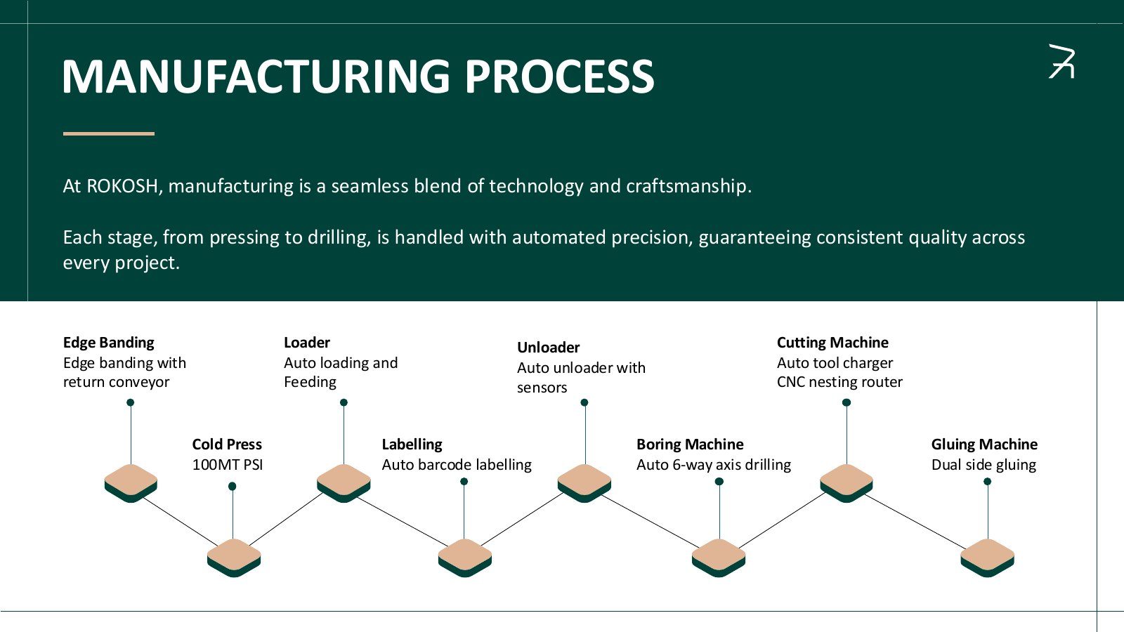
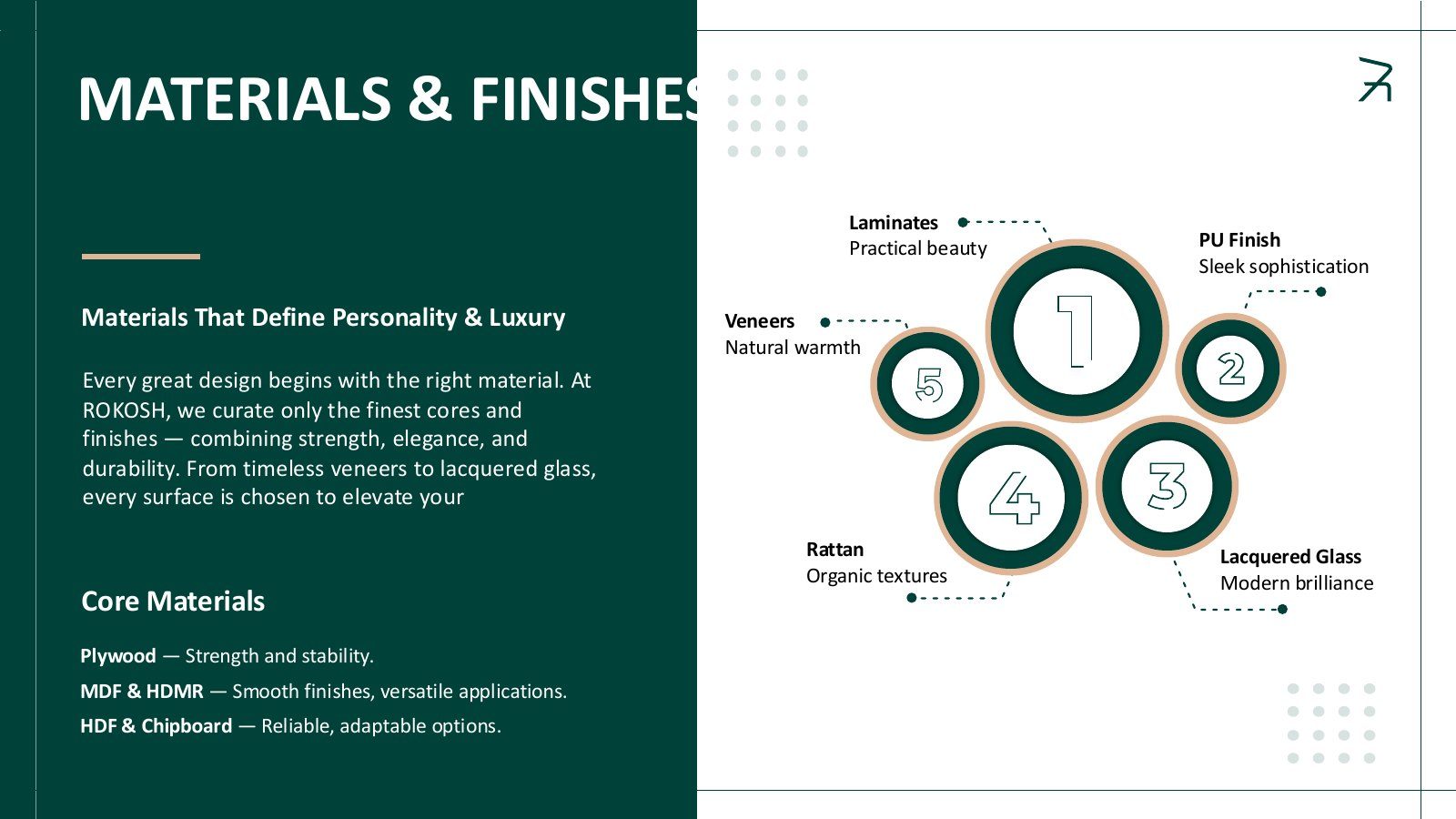
06 · Brochure & deck
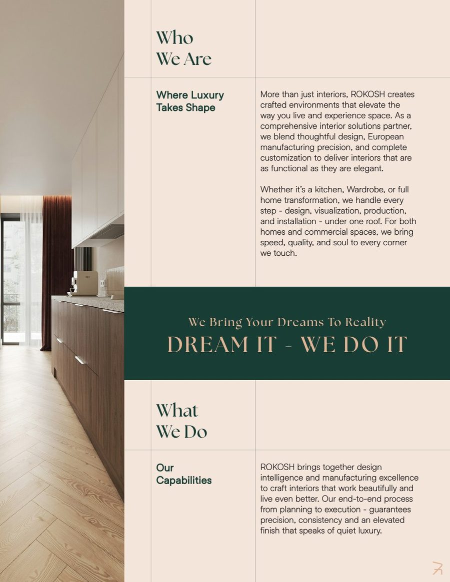
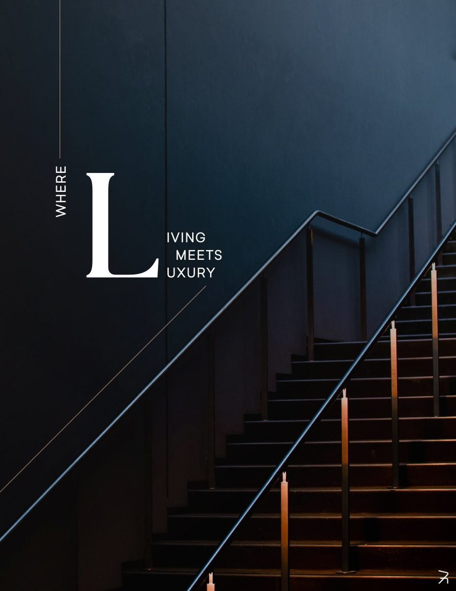
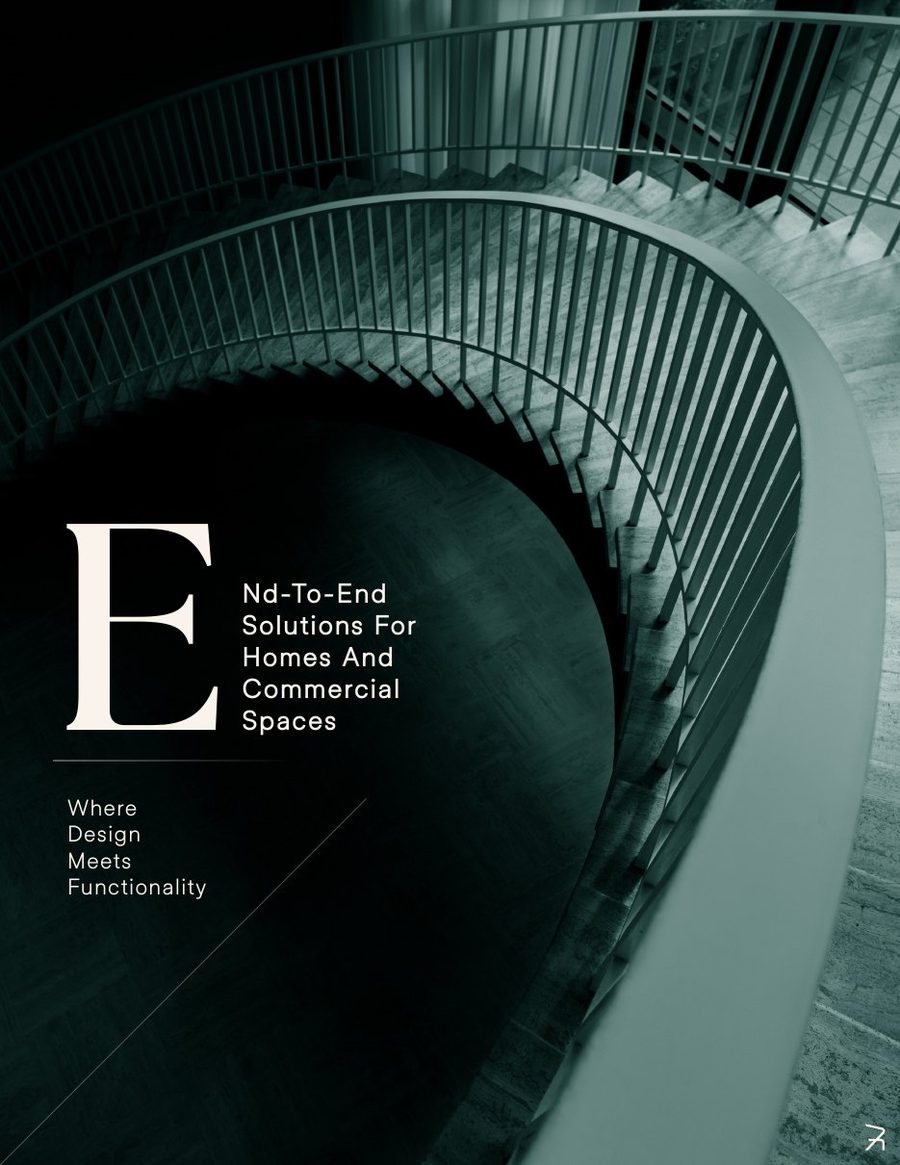
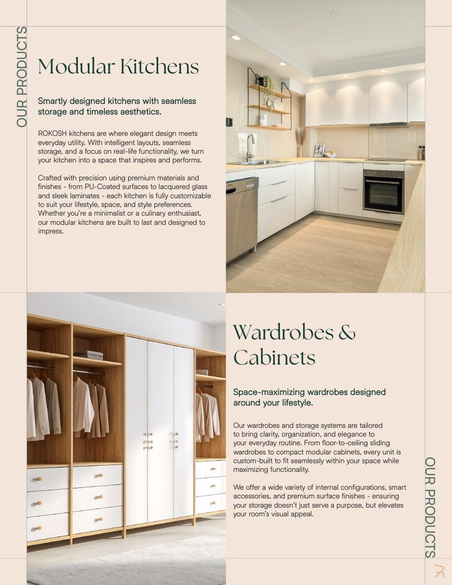
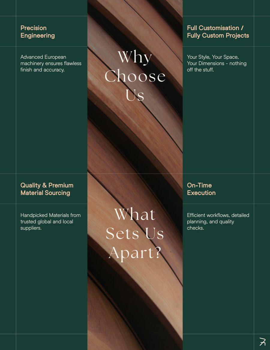
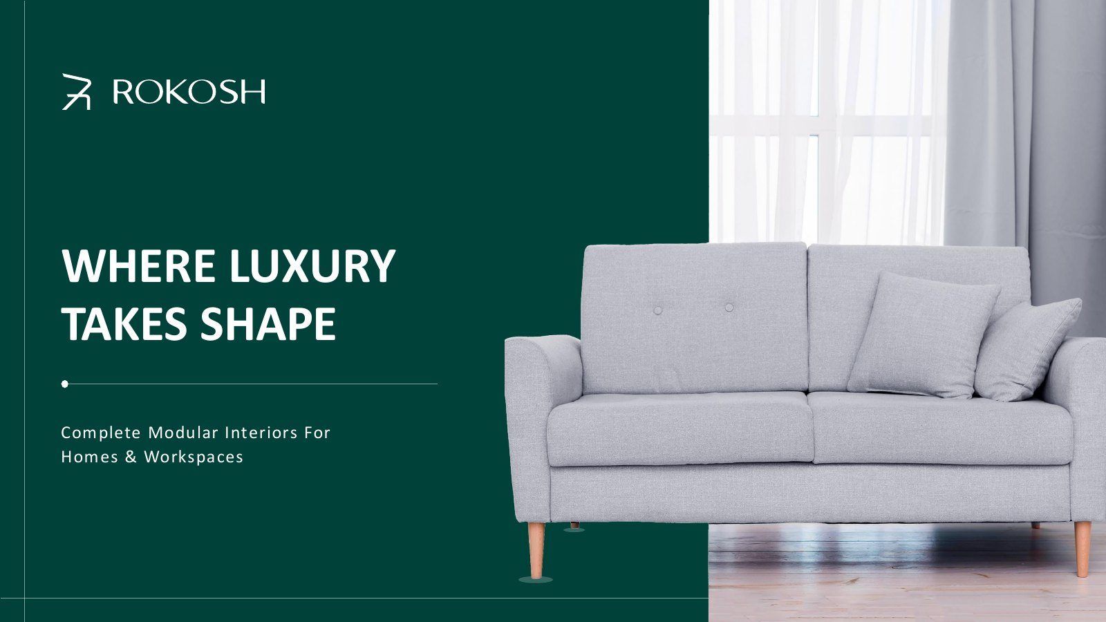
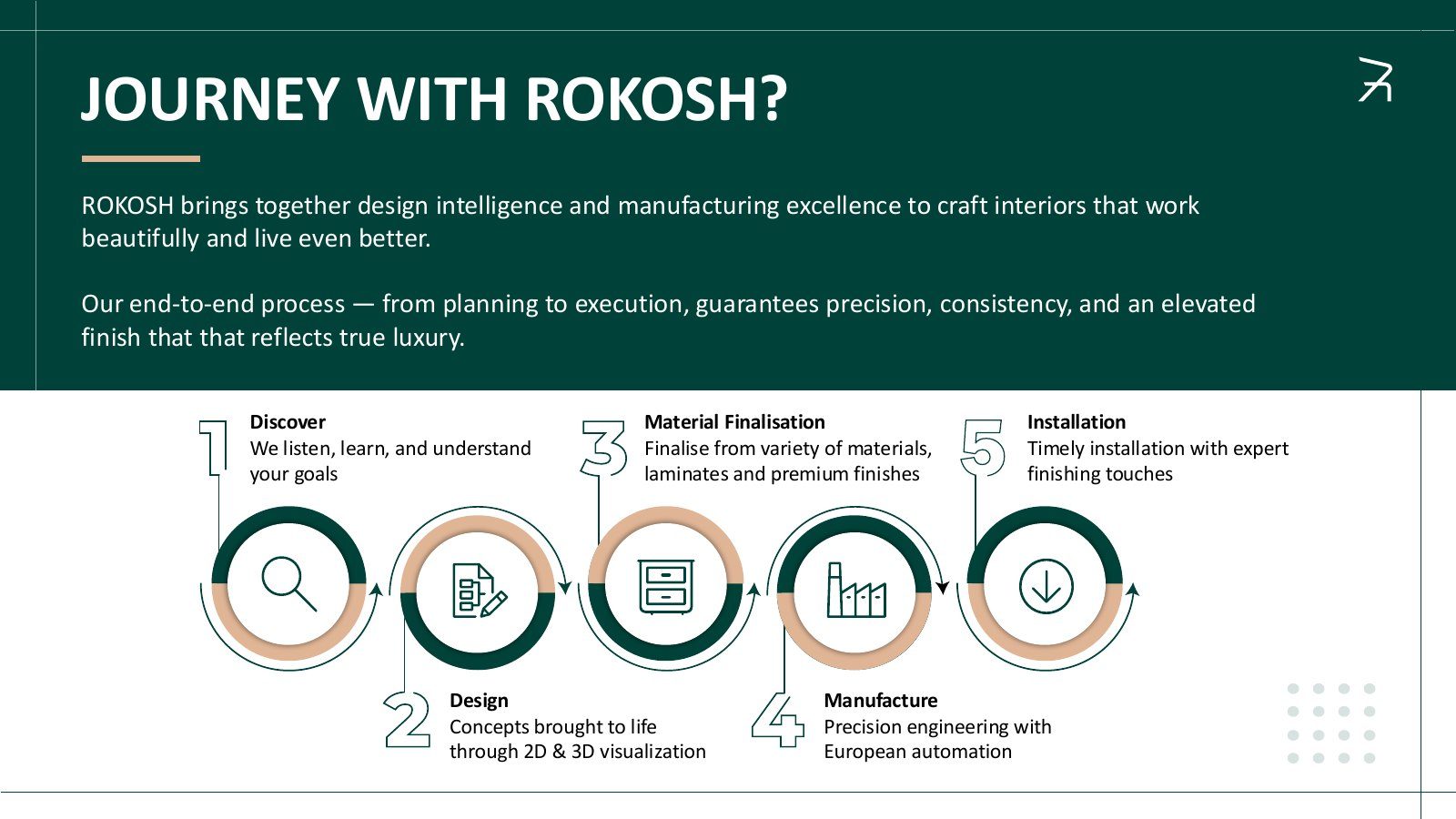
A 12-page digital brochure for clients and a sales deck for meetings. Large serif headlines, warm sand pages and real interiors.
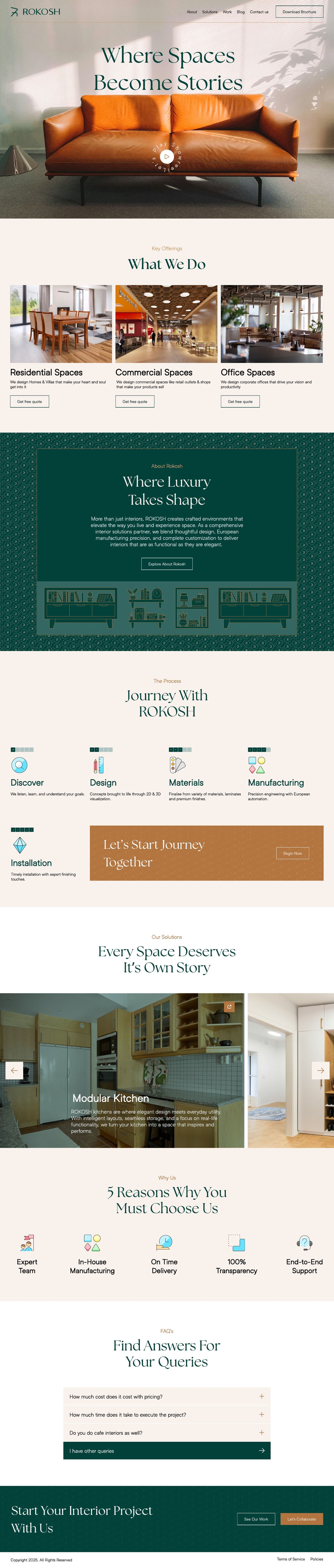
07 · Website
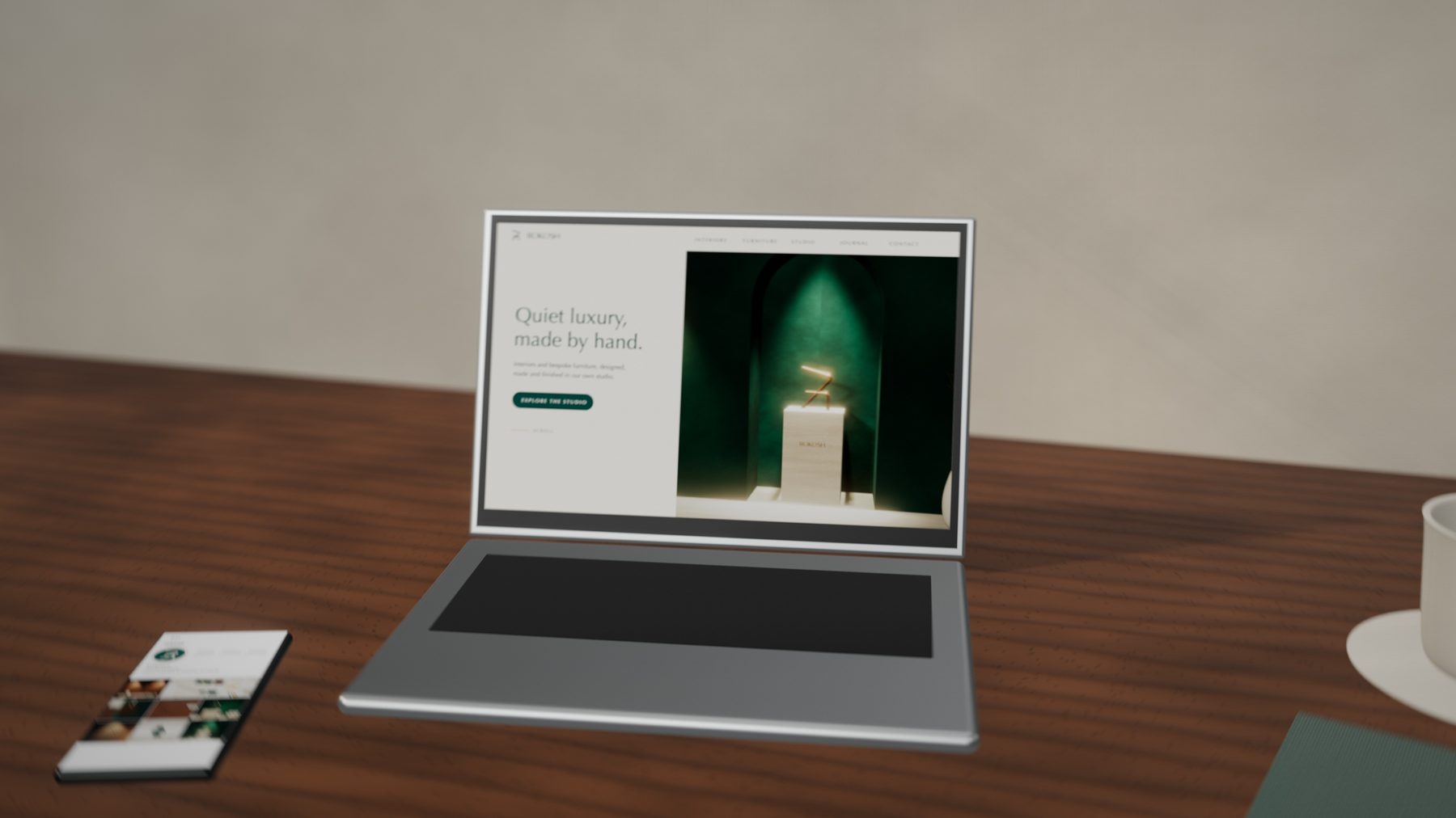
A homepage that reads like the brochure: what we do, the journey in five steps, products room by room, five reasons to choose us and a clear way to start.
Brand guidelines
32 pages from the 56-page book: logo, colour, type, pattern, photography, icons and applications. Drag or click to turn pages, or use the ← → keys.
The outcome
ROKOSH went from a nameless factory to a brand with a clear voice: one name, one mark and one system, ready for a showroom wall, a delivery truck or a client's inbox.